
What is AIS data?
These are the records logged by companies tracking AIS messages sent by vessels and other vehicles transmitting their location, status, activity, and so on. Most of the time these records are stored and exchanged in CSV files (text files where each record is a comma-separated list of properties or attributes). Each record has timestamp, longitude, latitude, vessel type, vessel status,… properties.
AIS data easily piles up in the millions and millions of rows as the data accumulates quickly when logging multiple hours and days of vessel traffic.
What are the top 3 paint points?
So here are the top 3 pain points that we hear from professionals having to work with AIS data.
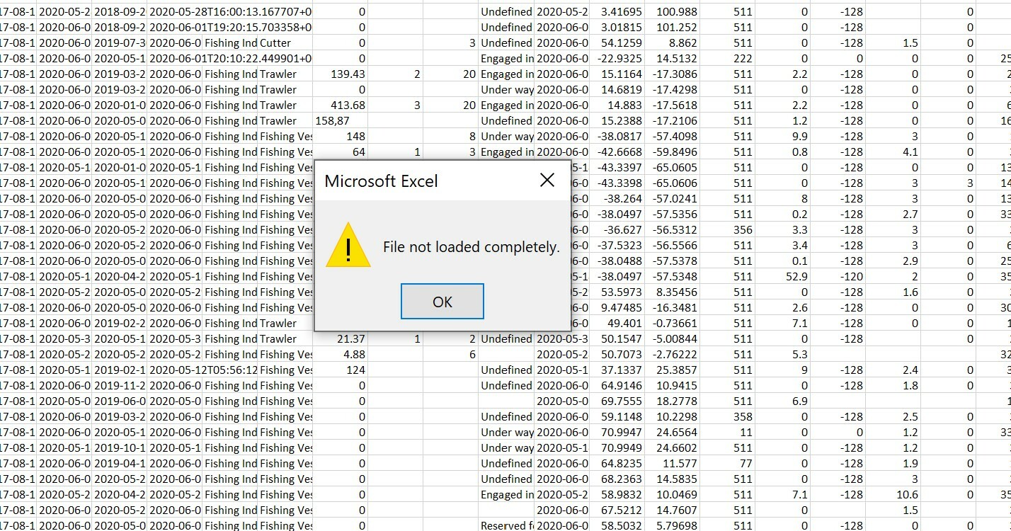
Pain point 1: I can’t open the data in Excel
That’s because Excel limits to about a million of rows (for the geeks among us it’s 1024×1024 rows).
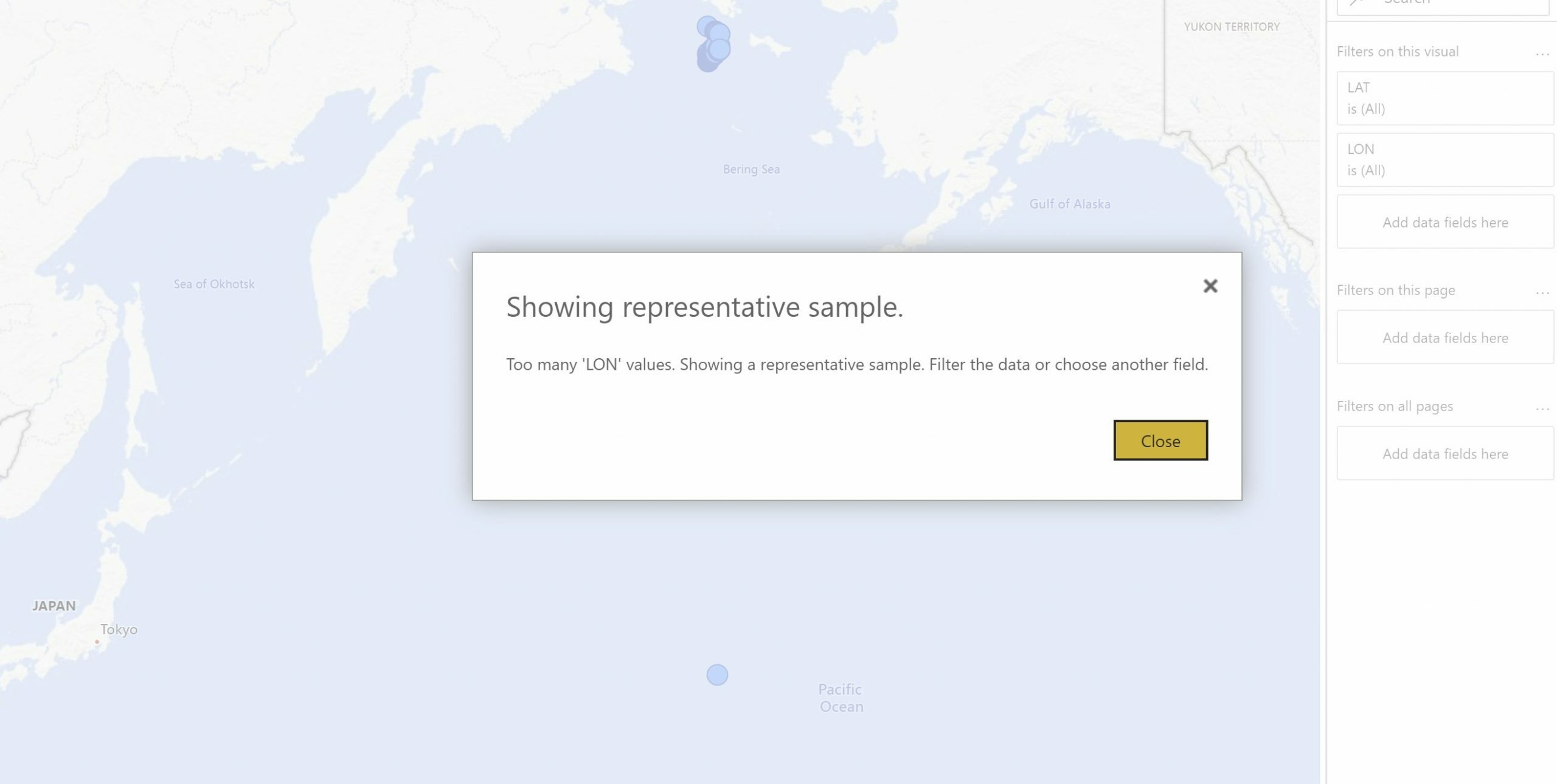
Pain point 2: I can’t get the data visualized in PowerBI
PowerBI does a great job at handling all sorts of data with great flexibility in creating visualizations. But it is not made to handle millions, let alone billions, of data points. In fact, the map shows a subset of the data, with reports in the community of handling about 3500 data points at most.
So given that traditional tools are a pain, a way forward is to consult your data science team to help you out. But what if you don’t have such a team? This brings us to paint point 3.
Pain point 3: I can’t extract what I’m looking for
“I am no data scientist and frankly we don’t have anyone in our team to go and write scripts to extract the data on passenger traffic that I’m looking for. Python? You mean, the animal?”
How we help our customers relieve their AIS pains
It is our mission to relieve those 3 pain points for our customers. Help them gain insight into the stories and events that are now buried in AIS data.
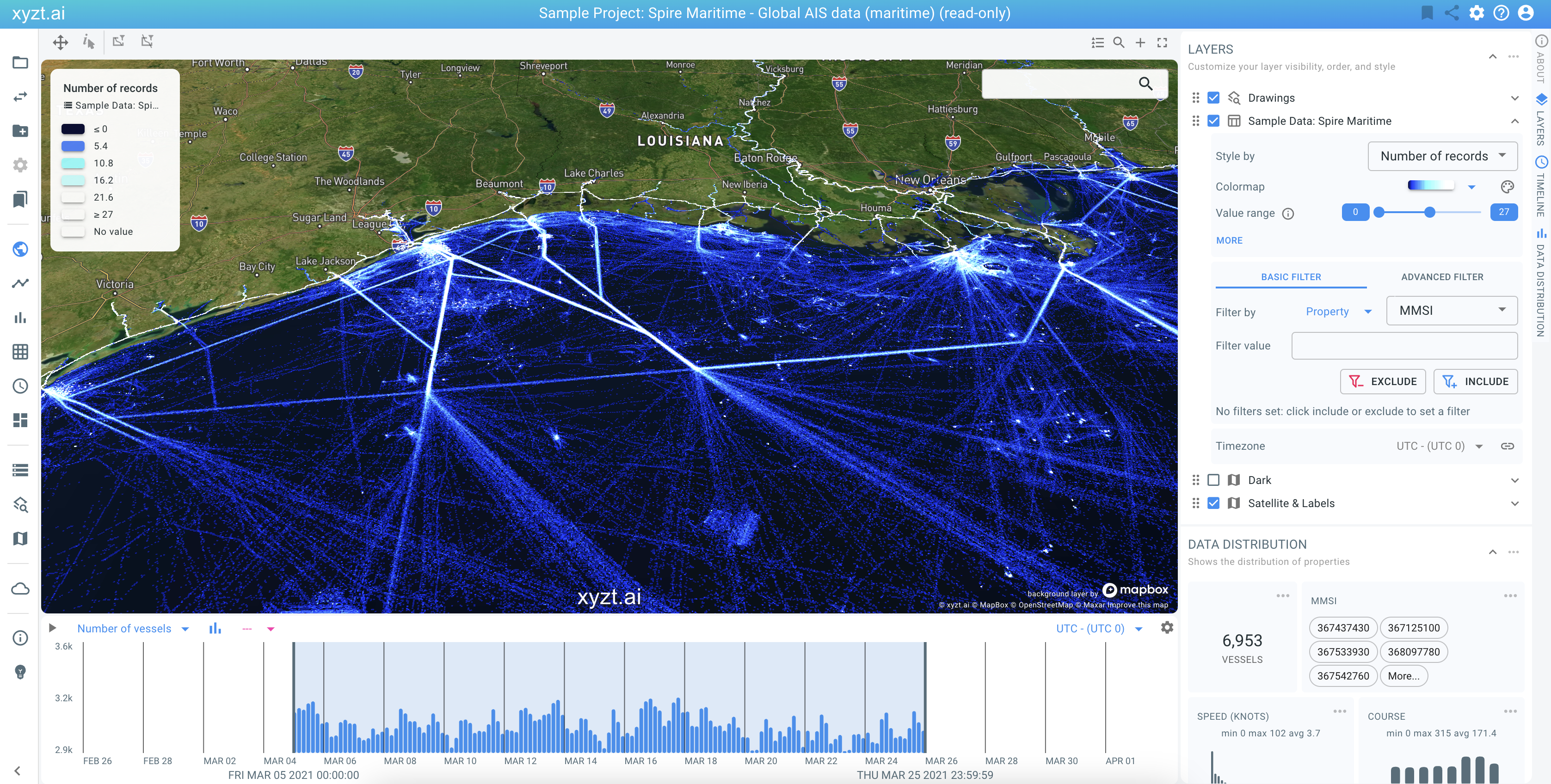
1 – Scaling to Billions
By developing our algorithms, data structures, and architecture to handle billions of rows, you can rest assure that our platform can handle your data. We designed our architecture so that you can even run our tools with billions of points on your smart phone (more on that in another post later).
2 – Instant Visual Insights
Humans are visual and AIS data can be much better analyzed through effective visualizations than through tables and spread sheets. But AIS data is much more than longitude and latitude plots on a map. Therefore our platform provides different views on the data:
- Heat maps counting not just records, but actual vessels underneath each pixel
- Attribute-based styling coloring the most common vessel type, status, or other property in an area
- A timeline showing a histogram of amount of vessels in the view, aggregated per day, hour, or minute.
- Bar charts with an overview of all attribute distributions
- Historic and real-time views
- Gridded, trajectory, and point data visualizations
The visualization is interactive with sub-second update rates when applying a spatial, temporal, or attribute filter, even on billions of data points. There is no need to write scripts and extract the data upfront, you can go live within a day with our platform, also if you are no data scientist.
3 – AI Driven Automation
Effective visualization is important, but given the sheer amount of data, automated insight generation using AI is where we put our eggs in the basket. Use-cases for AI-driven insight generation from AIS data are plenty:
- Guessing the true status of a vessel, e.g., to detect illegal fishing.
- Filling in gaps in the data, e.g., when a vessel turns off its AIS transponder or when the vessel goes off the radar.
- Estimating time-of-arrival to better plan logistics operations in ports
- And many many more.