
Pop the champagne! We’ve just released our second major platform update of 2021. We listened to your feedback and focused our development efforts on how we could help accelerate your location analytics capabilities.
If you’re new to xyzt.ai, we are a company that provides a big data location analytics platform that allows you to easily extract insights from anything that moves, such as vessels, aircraft, connected cars, and people flow.
In this post, xyzt.ai’s CTO, Bart Adams, will focus on this release’s top ten favorite new features. Read on as you will get to experience the power of xyzt.ai’s V2021.1. Make sure you check out number ten, it’s really cool.
10 new location analytics features
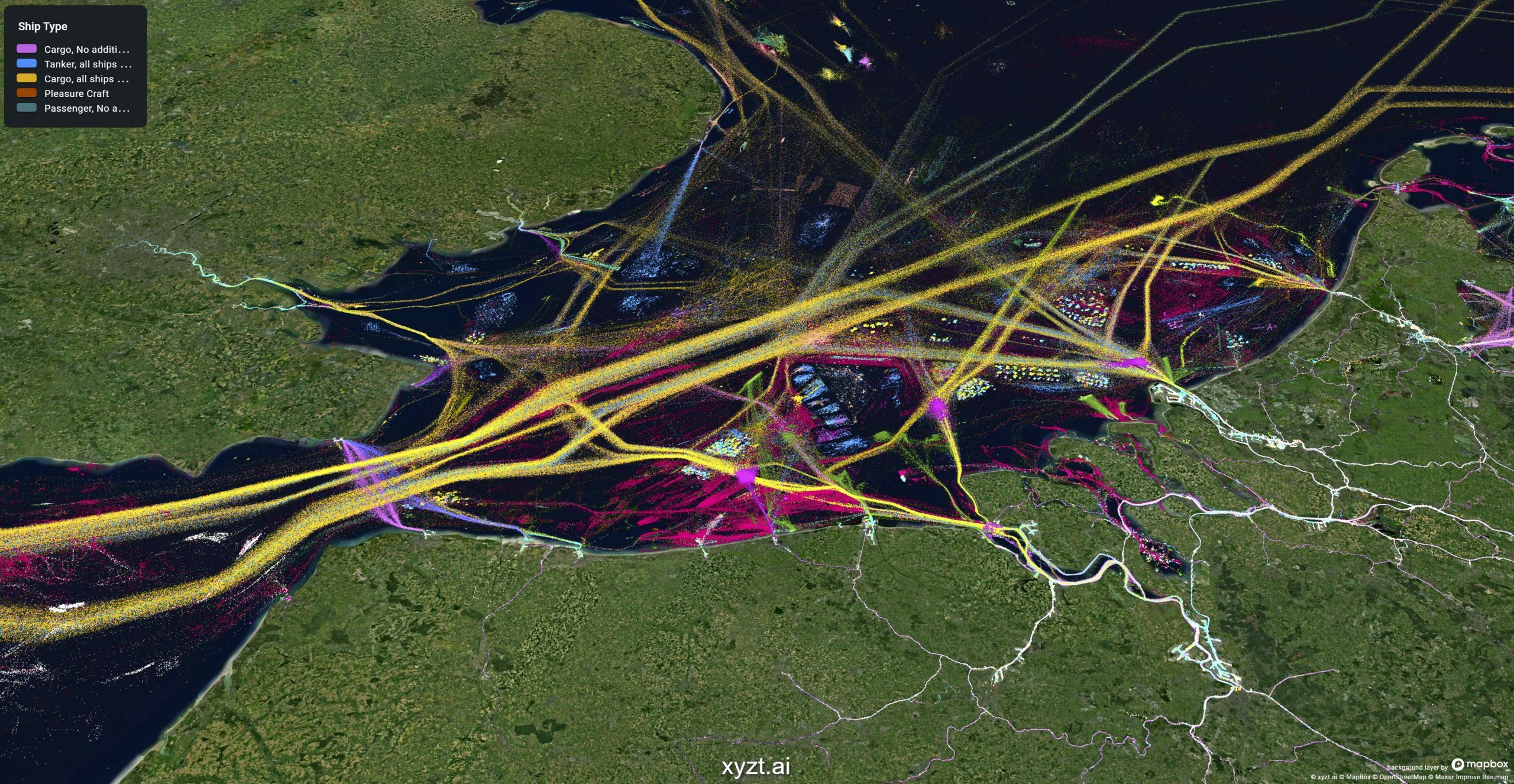
1. Data-driven styling customized to your needs
Humans are visual, and the best way to tell a story is through presenting your data and insights. It is of key importance to choose the right way to do so; on a map, as a bar chart, on a dashboard, with the right colors and styles. We provide you with complete flexibility for this.
With this release, we extended the visual styling capabilities to your needs. You can now define your gradients and color maps, driven by the properties in your data.
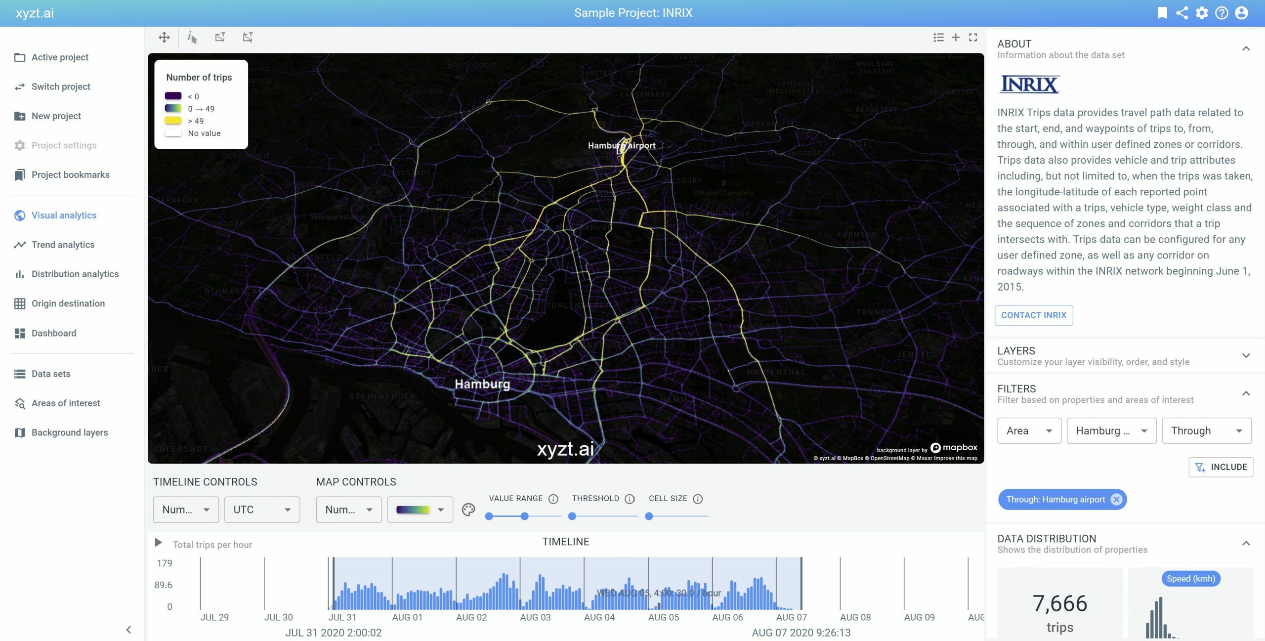
2. Analyze traffic flows with origin, destination, and corridor filters
xyzt.ai is a location analytics platform focused on extracting insights from anything that moves. Analyzing where the traffic comes from, or where it goes, can now be done by simply drawing areas on the map and using them as spatial origin and destination filters. In addition, you can look at all the trips or journeys passing through an area. This is often called corridor analysis.
Thanks to the multi-scale data representations, these filters can be applied at a local scale (e.g., for analyzing traffic in a city) or at a global scale (e.g., for analyzing maritime shipping worldwide).
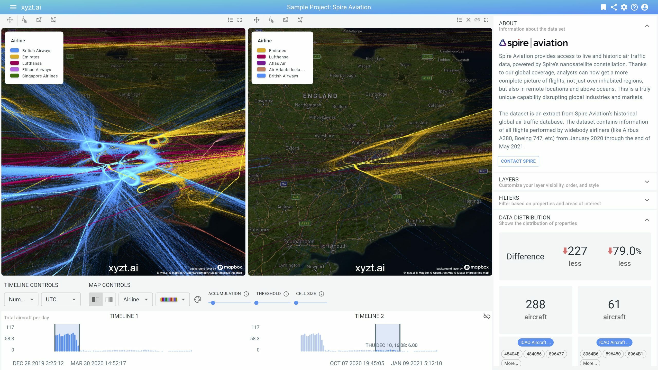
3. Split-View Analysis
Sometimes you need to know what’s changed. New regulations may have been introduced and you need to analyze the difference in traffic before and after.
Or you need to analyze the performance and traffic in one port terminal and compare it to another.
Or you want to visualize the same data set side by side with two different stylings (e.g., style by vessel type and style by navigational status).
You can now split the view, timeline, and widgets in two and analyze and compare two time periods, two regions, or any two subsets in your data.
Curious what your data would look like and what new insights you might discover?
Book a demo and discover how you can optimize your location analytics capabilities.
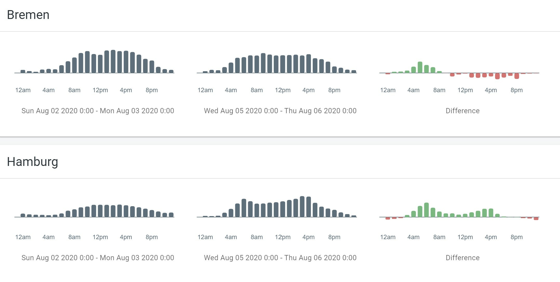
4. When is it busy?
You can now easily analyze when traffic is busy, when there are the most people in the shopping mall, or when the anchorage zones near a port are congested.
You can do day-of-week and hour-of-day analysis and compare different time periods and areas.
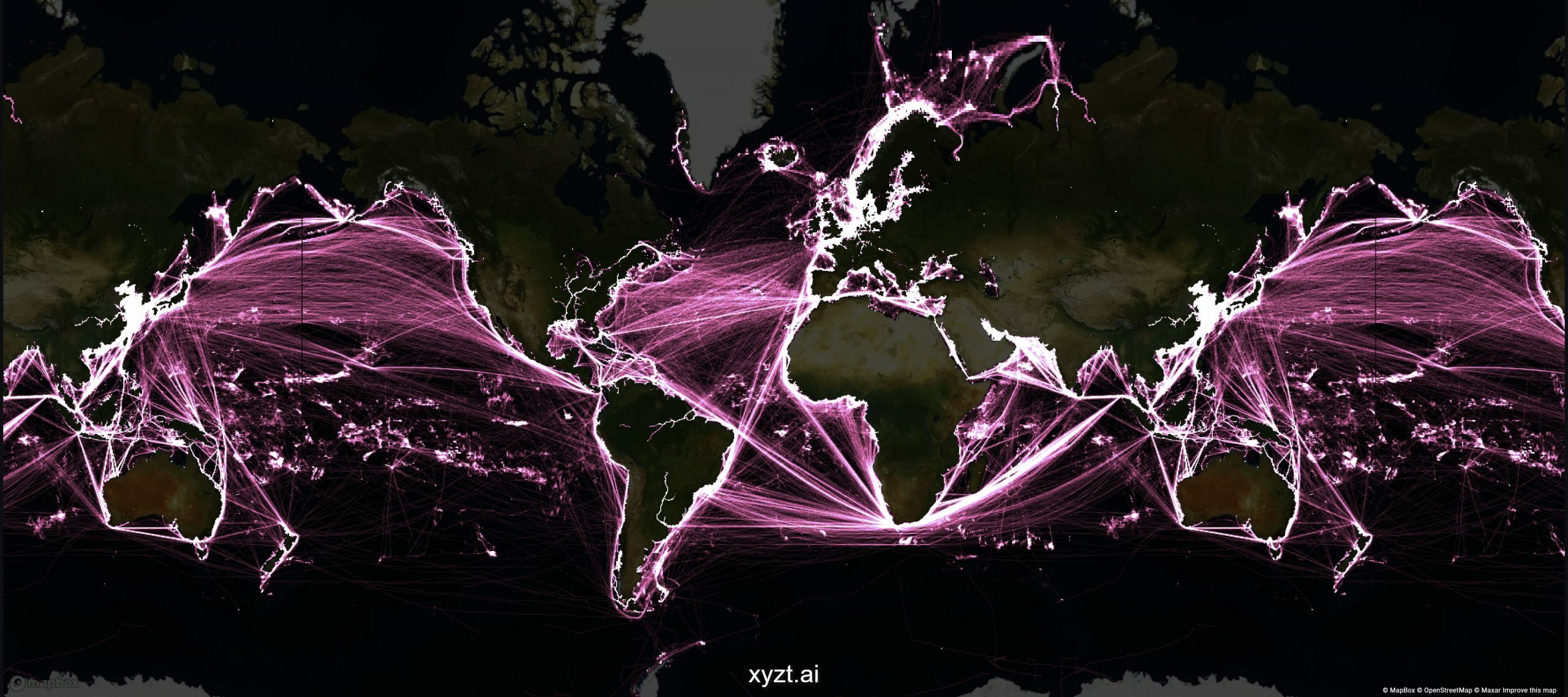
5. Travel around the world with carousel maps
The Earth is approximately a sphere, though when visualizing it we project it to a 2D surface. Instead of showing your data as a single rectangle from longitude -180 to 180, we now repeat it every 360 degrees so that you can analyze movements close to and across the dateline.
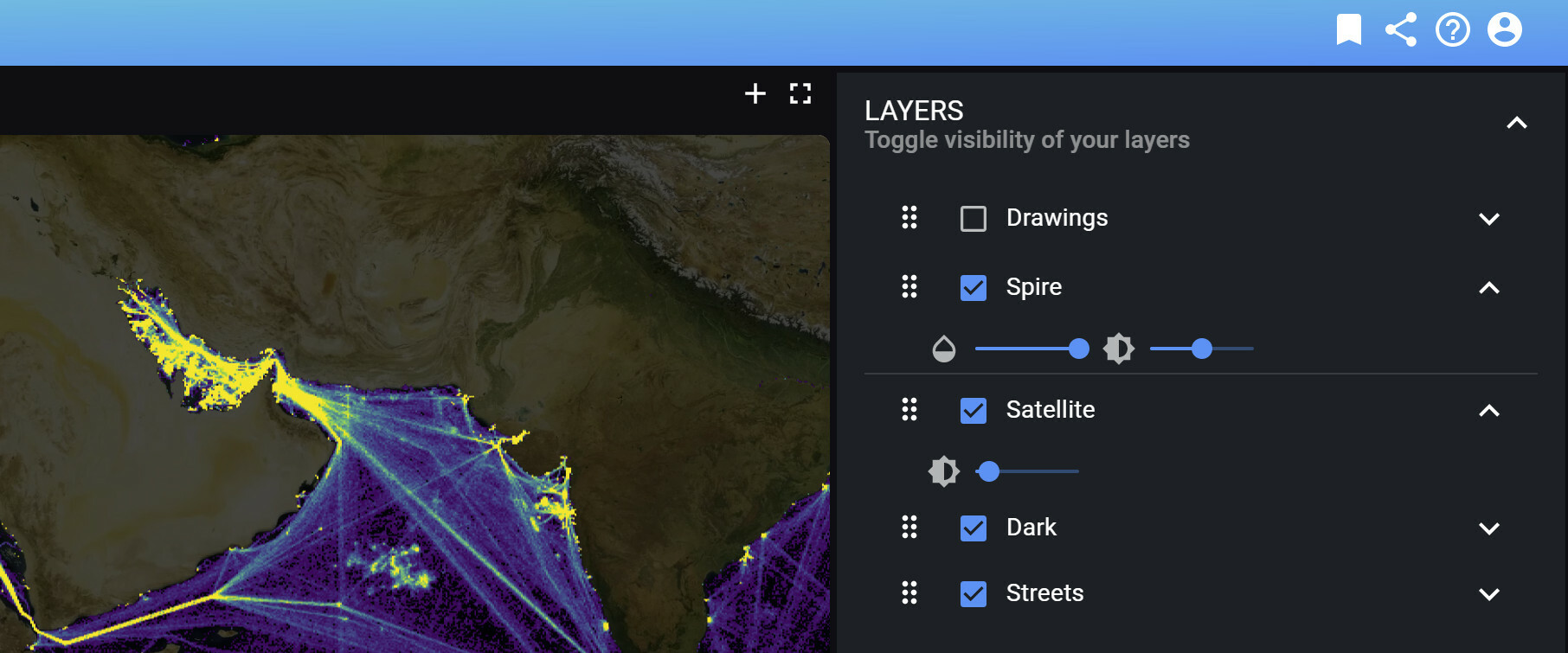
6. Let your data pop using layer styles
Sometimes you want to make a background layer darker and a foreground layer brighter. Maybe you want your data to be transparent to show the map beneath or change the ordering of your layers.
The layer panel now allows you to control the opacity, brightness, and order of your layers. For example, you can now make the Mapbox Satellite layer darker to ensure that your data stands out.
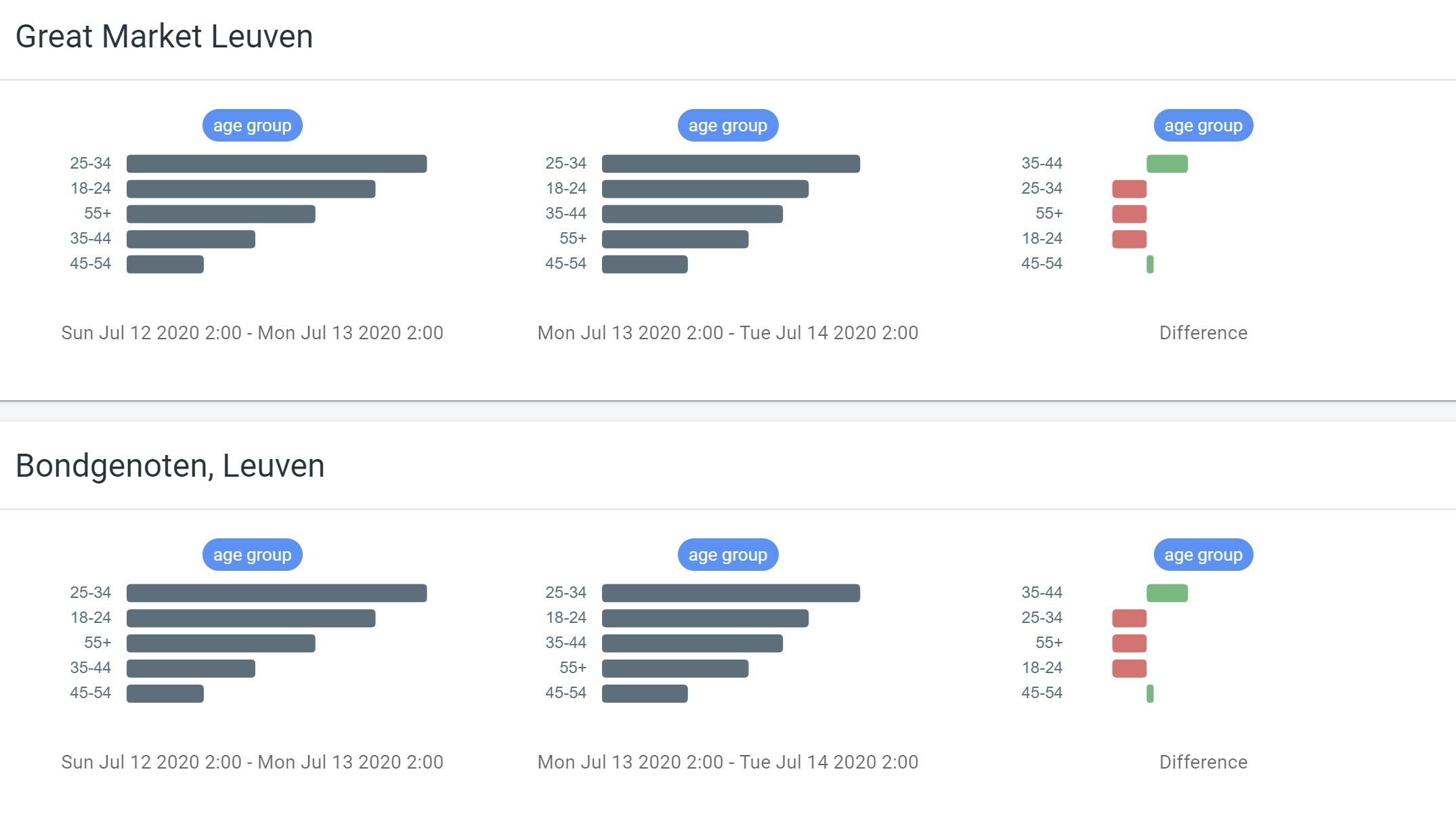
7. Discover distributions in your data and understand segments
There is now a dedicated analytics page to analyze distributions or segments in your data.
If you are analyzing footfall traffic for retail performance analytics, you can now easily see how the audience is divided into different age groups for example.
If you are a maritime trading analyst, you can now easily see the distributions of draught over time in the different docks and terminals.
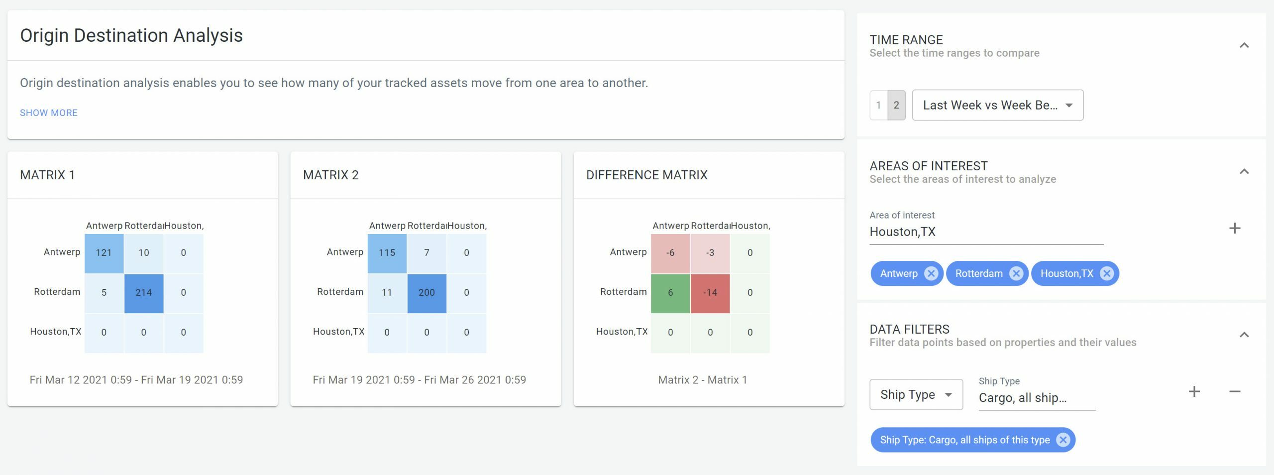
8. Origin destination (OD) matrices
We have added a dedicated page to perform origin-destination analysis between multiple areas. Say for example you want to see the amount of traffic between all neighborhoods in a city.
The OD page provides you with an instant overview through so-called Origin-Destination Matrices:
- Pick your time period(s) and see how traffic flows between the different areas.
- Apply filters to focus on a subset of your traffic and place the results on the dashboard or share them using the shared link capability.
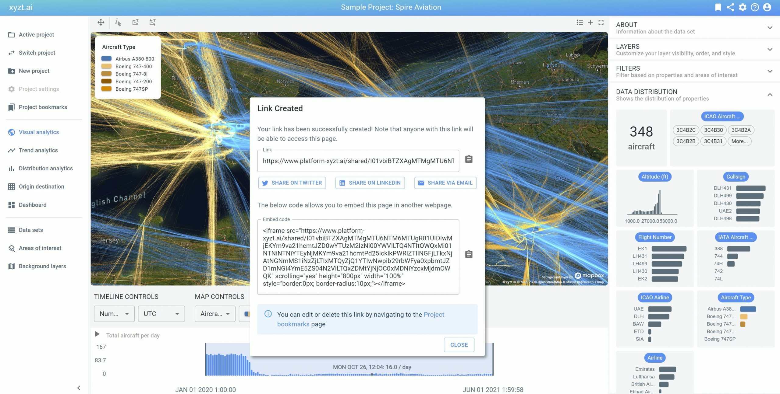
9. Bring insights to your audience using externally shareable links
As a SaaS platform, we allow you to collaborate with your team within your organization. In this release, you can now share your work with your customers, partners, and your marketing audience.
- As a port authority you can share insights on vessel movements from AIS data with your terminal operators, or with the sea police, for example, when assisting during an incident analysis case.
- As a smart city mobility analyst, you can now perform traffic analysis and share the findings with the press and policy makers, in a beautiful and interactive way.
10. Embed interactive visualizations and analytics in your own platform or web page
In addition to sharing, you can also embed xyzt.ai in your own platform. By embedding, we mean adding any of the maps, views, dashboards to your own webpage. As a data company, you can build beautiful data stories, and instead of embedding static images and movies, you can now embed a fully interactive view on your data, allowing the reader to further interact with and explore the data. Try for yourself by interacting with the embedded xyzt.ai Visual Analytics page below.
As sharing and embedding bring new business opportunities for your organization, we will do a separate blog post on this.