What is a density map?
A density map is a special case of heatmap. A heatmap is a visual representation of data, representing data values as colors. When the values amount to a number that is counted, e.g., number of people, a heatmap becomes a density map.
Density maps are a useful tool to analyze data, to reveal patterns, hot spots, and outliers.
In the xyzt.ai platform, density maps are visualized spatially, i.e., over an area such as a country, a building, a city, a port,… or the entire world.
Use-cases for visualizing density maps
Density maps are used for many cases, for example to:
- From connected taxi data: Analyze areas where taxis are mostly picking up or dropping off travelers.
- From vessel tracking data: Find hot spots of fishing activity.
- From indoor forklift tracking: Identify most busy areas in warehouses.
- From mobile device data: Compare footfall traffic for different store neighborhoods.
Challenges with density maps
Density maps are easy to understand: for every area you are interested in (e.g., every pixel on screen), you count the number of records below that area and map the resulting value to a color.
Challenges
As easy as it sounds, there are a few challenges:
- To compute a density map you need to "visit" every record in your data set. If your data is big, this means it can take time to load and iterate over the data. How to do this without overloading your browser?
- Every area or pixel on screen is "touching" only a smaller subset of your data, but how can you avoid iterating over all your data for every area or pixel?
- What if you don’t want to count the number of records, but instead the number of people, or the number of vessels, or cars and want to avoid counting the same person, ship, or car multiple times underneath the same pixel?
- How to update or re-compute the density map, if you want to apply a filter, for example to look at a specific time period, or a specific type of vessels? Can this be done interactively?
How others handle density maps
Some solutions use data visualization tricks to compute density maps, by for example using WebGL to paint and accumulate colors on screen using a technique called additive blending. This has the serious drawback that all data needs to be sent to the client’s browser and a powerful GPU is needed to obtain good performance. Such solutions are often limited to a couple millions of data points.
How xyzt.ai handles density maps
With xyzt.ai we handle density maps differently, and compute them using specialized data structures close to the data, i.e., in the backend. This means billions of data points can be handled easily.
The platform maintains interactivity, even when applying filters: the density maps are not pre-computed, but are instead on-the-fly evaluated applying any temporal or attribute filter, and user-defined styling.
Visualizing density maps with xyzt.ai
For this tutorial, we are going to work with one of the sample projects on the platform (you need a login or obtain a login here).
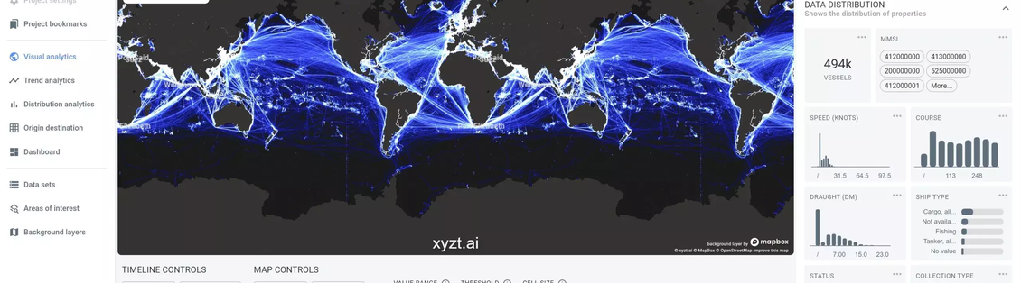
If you follow this link you end up on the Visual Analytics page showing maritime vessel movement data.
About the data
The data is 3 weeks of Spire Maritime with in total a little under half a million vessels and 1.24 billion records. Each record consists of following attributes:
- MMSI: the identifier of the vessel
- Time: a timestamp when the record was recorded
- Longitude and Latitude: the location on earth
- Speed: the velocity of the vessel
- Course: the direction the vessel is heading
- Draught: the draught of the vessel
- Ship type: the type of ship, e.g., Cargo, Tanker, Fishing,…
- Status: what the vessel is reporting doing, e.g., Underway using engine, Moored, At anchor,…
- Collection type: whether the data was acquired through satellites, terrestrial receivers,…
Even though this data is maritime data, the tutorial can be applied to other tracking data as well.
The standard Visual Analytics density map
When you open the Visual Analytics page for the first time, the map shows a density map, where:
- The density map shows the entire spatial extent, i.e., the map fits on your entire data set.
- It shows the entire temporal range, i.e., the timeline fits on the entire time range in your data.
- A default colormap is applied mapping values between 0 and 50 to a gradient that goes from dark blue to white.
- The density map counts records underneath each pixel on screen
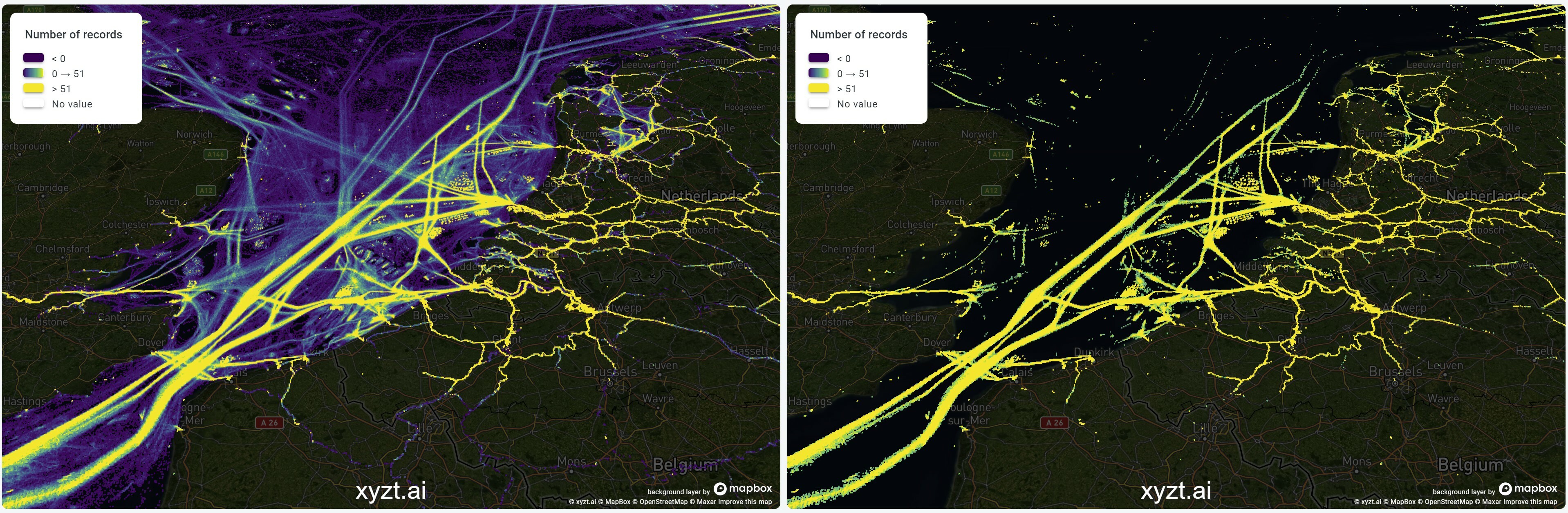
Viewing the density map at different scales
Zoom in on the map using the scroll wheel to see the map at a finer scale. The density map will adapt and reveal more detailed patterns.
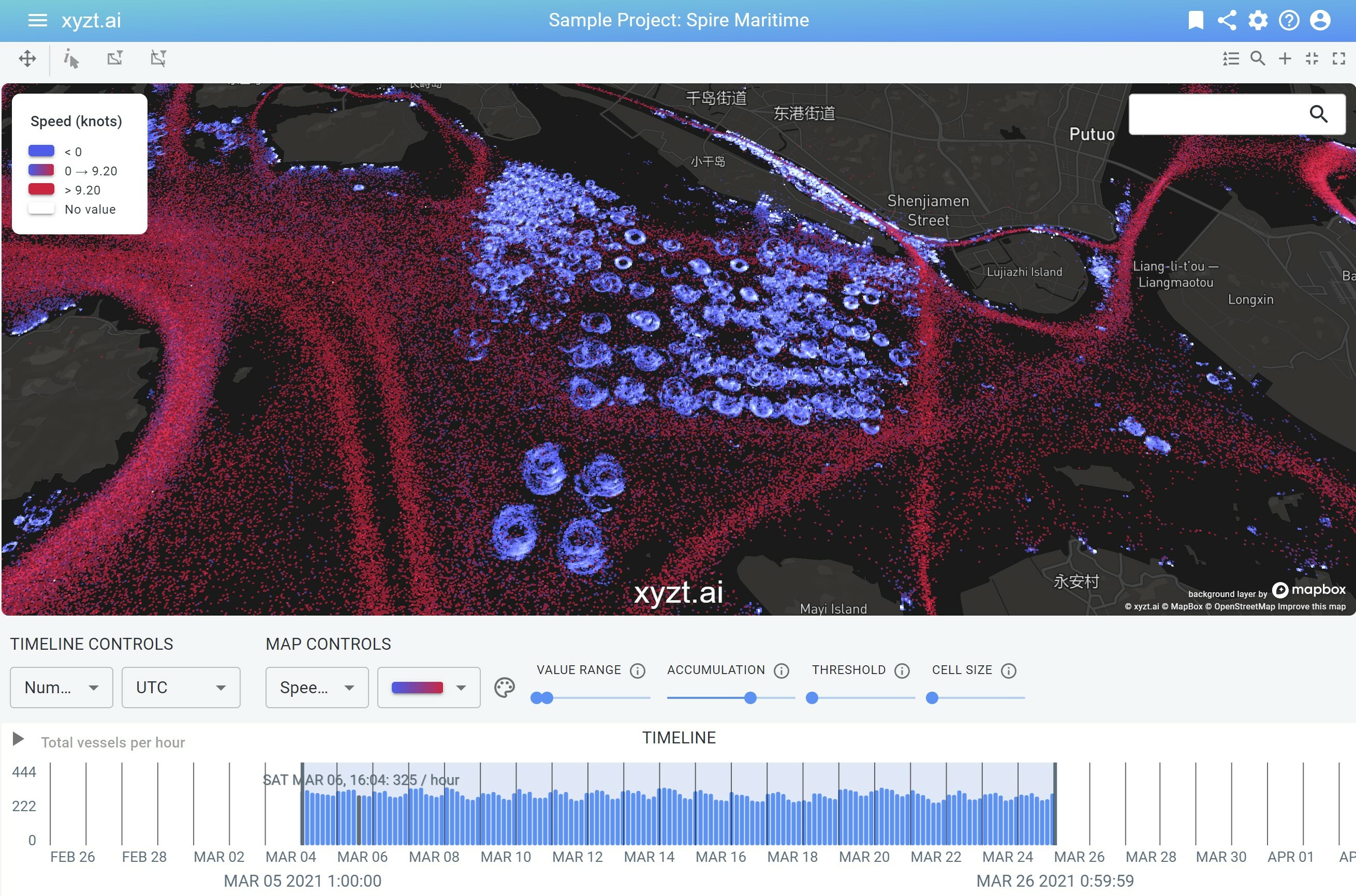
Applying filters
Density maps in the xyzt.ai platform are not just pre-computed images, they are computed on-the-fly and take into account any filter defined.
Temporal filtering
- Drag one of the two vertical lines to the left or right to change the time interval.
- Zoom in (by using your scroll wheel) to reduce the time window and to allow for more fine-grained temporal analysis.
In both cases, the map should update and show a density map only counting records that lie within the time interval.
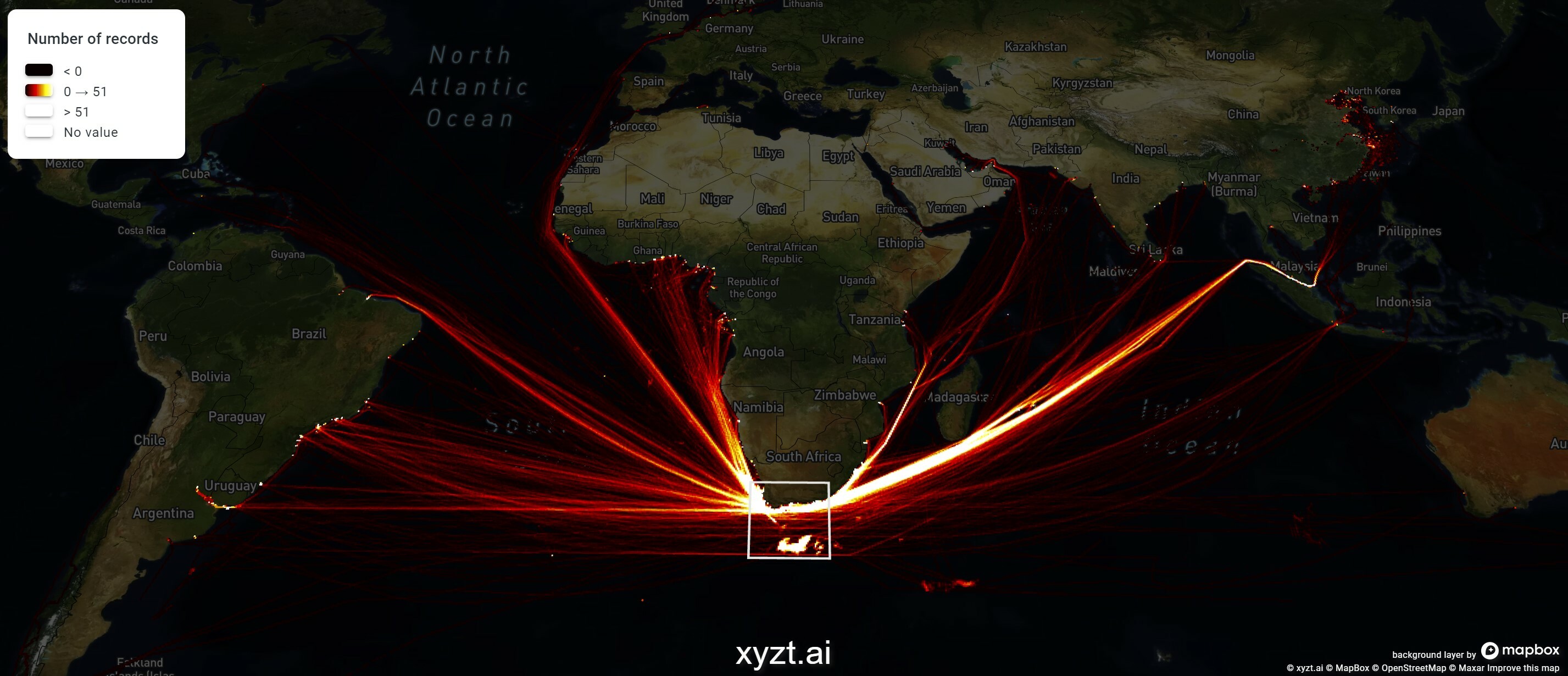
Spatial filtering
There are four ways to spatially filter your data:
- By zooming in on the map only records inside the view port (the visible area) will be used.
- You can use one of two spatial filter controllers in the map menu bar and apply a rectangular region for filtering to see only what is inside the rectangle, or passing through the rectangle.
- You can draw one of 3 shapes: a circle, a rectangle, or a polygon and use this shape as a filter.
- You can load a GeoJSON file with points or polygons and use the shapes as filters.
Property based filtering
You can filter out records by applying a property based filter on the right, using following steps:
- Select
Propertyin the first combobox - Select one of the properties, such as
Statusin the second combobox - Select one of the values, such as
Underway using enginein the final combobox - And click
Excludeto exclude all ships with status underway using engine - Or click
Includeto maintain all ships with this status
Of course multiple filters can be combined.
Changing the colormap
Density maps are visualized by mapping the counted number of records to a color. You can change this mapping by choosing one of the default colormaps, or by configuring your own by clicking on the "Palette" icon. You can find these controls under MAP CONTROLS in the middle of the Visual Analytics page.
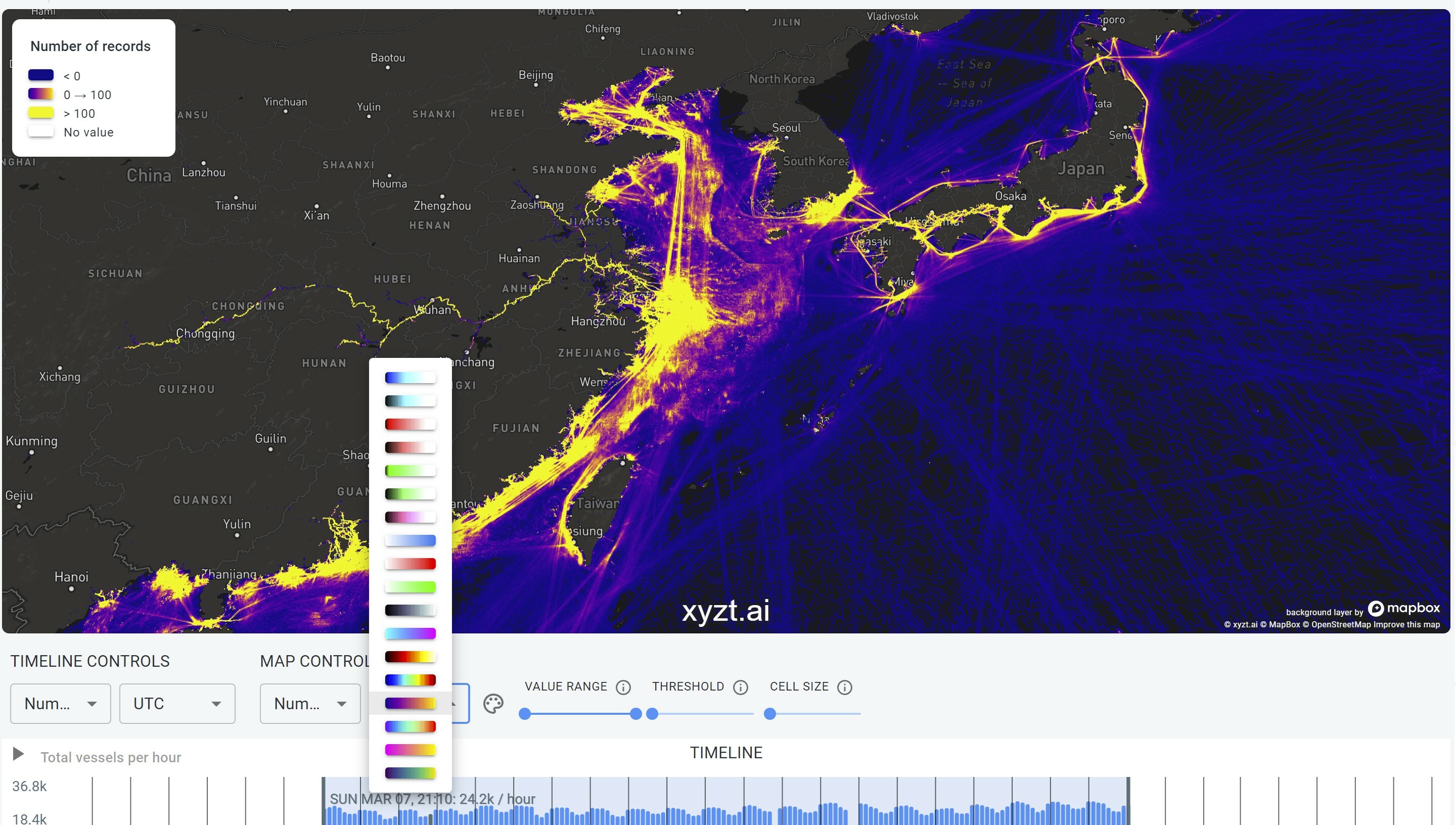
Changing the value range
By default the range [0,50] is mapped to the colormap colors. You can change this by dragging the range slider knobs to for example map a smaller range, e.g., [0,10]
to the colormap. This can be useful to accomodate for regions with lower densities, while still being able to discriminate between different values easily.
Thresholding your data
The slider next to the VALUE RANGE slide allows you to erode away areas with low densities and focus the map on areas that reach a threshold density value.
Changing the cell size
You can increase the cell size, or bin size, used to compute the density map, to count records in larger areas. You do this by dragging the CELL SIZE knob.
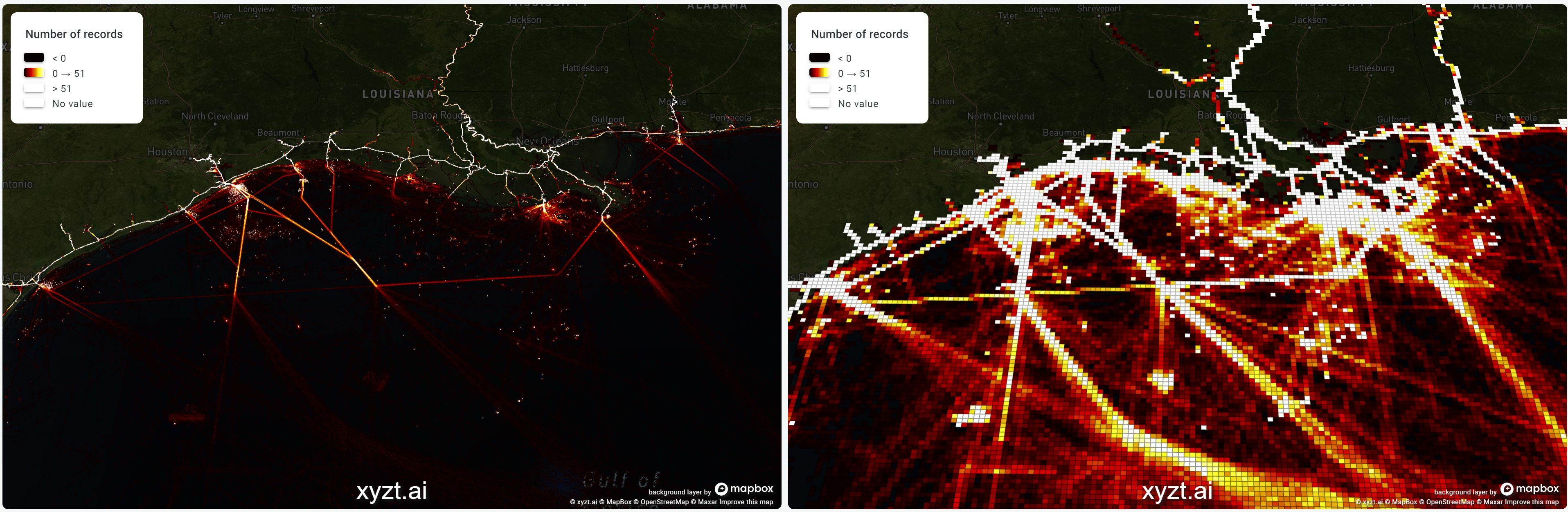
Note
In case your data covers a small area, there might be only one level available, and the cell size slider will have no effect.
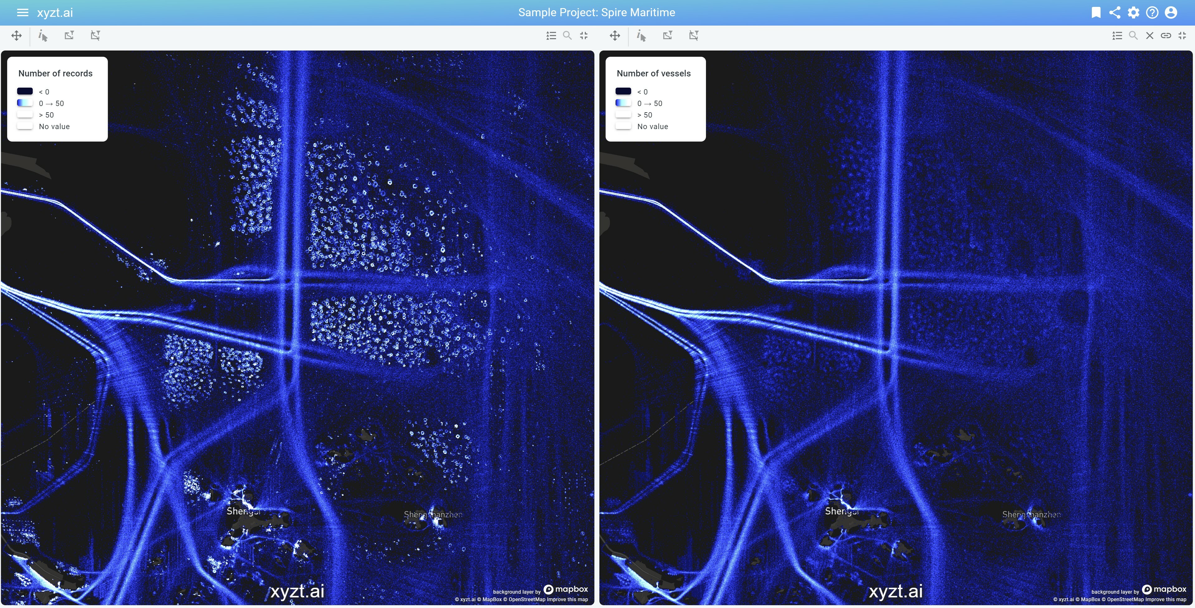
Changing the type of density map
There are two main types of density maps:
- The default one counting number of records.
- A second one counting the number of "assets", which in the example case is number of vessels.
You switch between both by selecting the first dropdown box underneath MAP CONTROLS and switching between Number of records and Number of vessels.
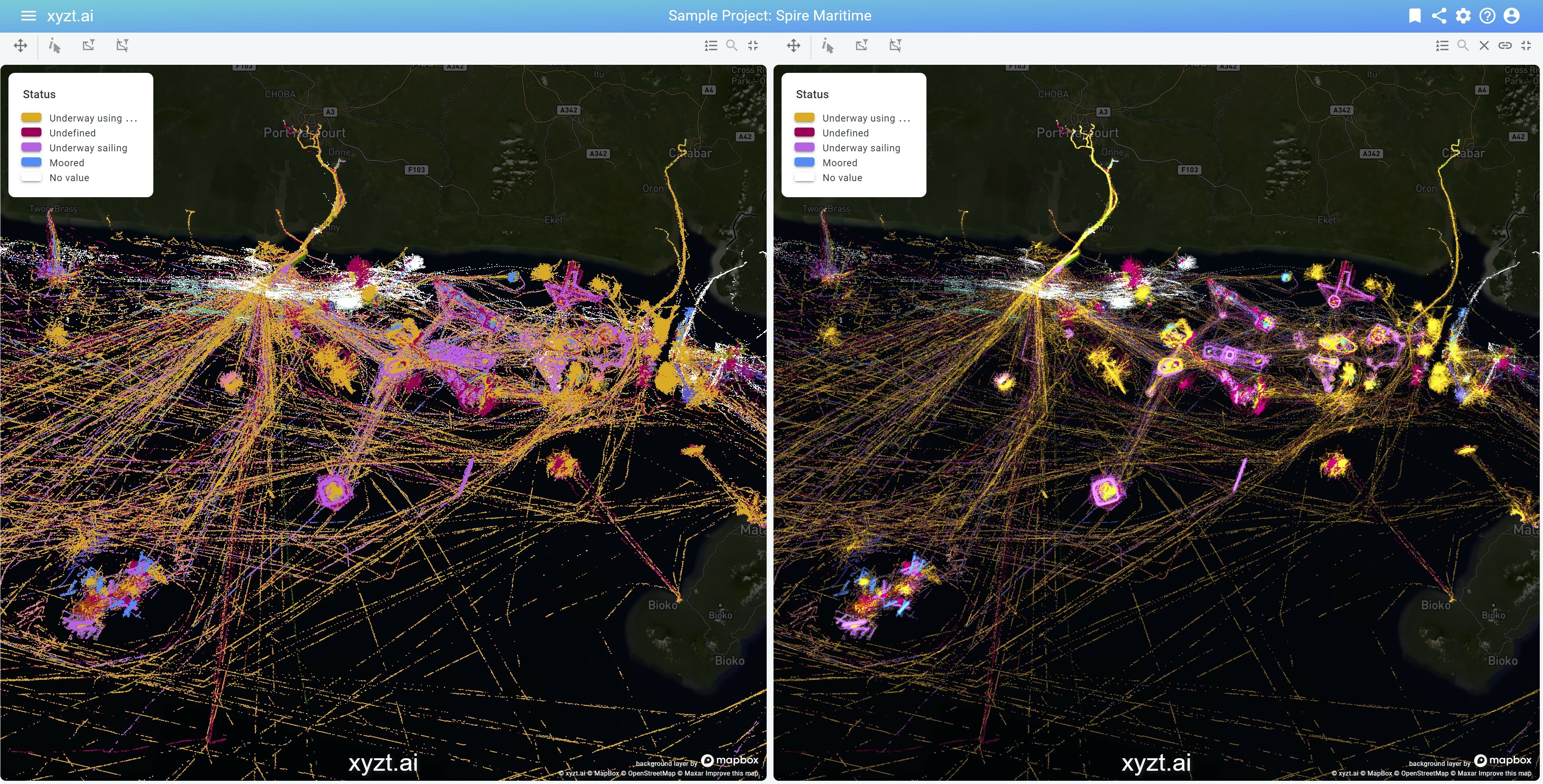
Using multi-colored density maps
The xyzt.ai platform enables you to use density maps also when coloring your data based on a data property.
Let’s make this more concrete with an example. Assume you are visualizing your data colored by the Status property, showing a different color for every possible status.
Now, the platform allows you to modify the intensity of each color based on the number of records below the pixel. This is called Accumulation coloring and is enabled by default through the ACCUMULATION slider. Accumulation modifies the intensity based on the number of records underneath each pixel, providing a sense of where your data is dense. Accumulation does not modify the hue. Move the slider completely to the left to disable accumulation coloring.
Conclusion
Density maps are a powerful tool for data visualization and insight generation. With xyzt.ai you can handle them easily, even for billions of data points. And even then we do not compromise on interactivity and allow you to filter and style your data to focus your analysis on what is important to you.
Feel free to reach out for a live demo.