When our customers tell us how easy it has become to successfully navigate their big data, it always makes us smile.
We couldn’t help ourselves and made it even more easy.
Scroll down to read all about the 5 new user benefits of the xyzt.ai location analytics platform!
1. Create your top 10 list based on values in your data
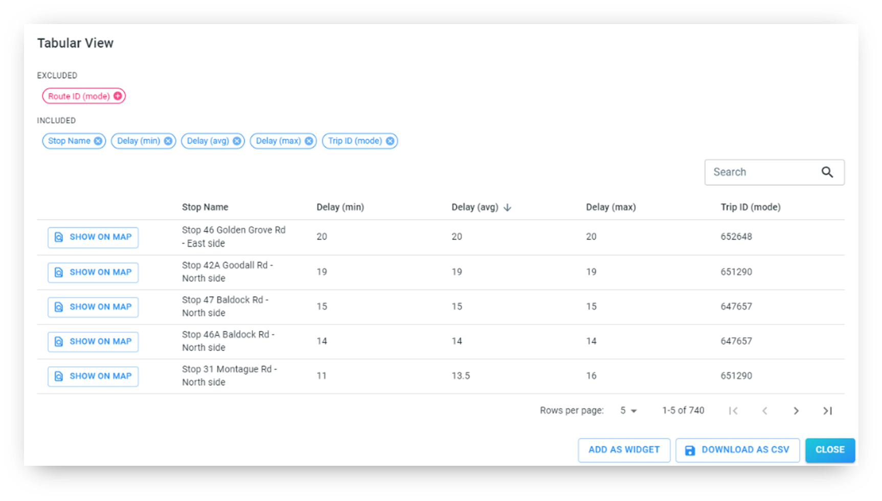
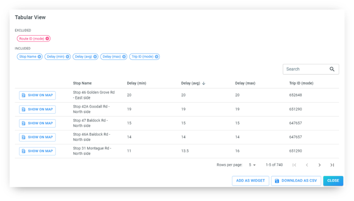
Approach your data from a tabular perspective. We have added the option to create a table view of
whatever data you are analyzing with sorting capabilities based on values found in the data.
This new user benefit enables you to create lists and get a direct overview of the most important
activity regarding what you are most interested about in your data.
For example, imagine you are analyzing a public transit network. In that case, you will be interested to know which stops experience the most delays or in which streets the most accidents occur.
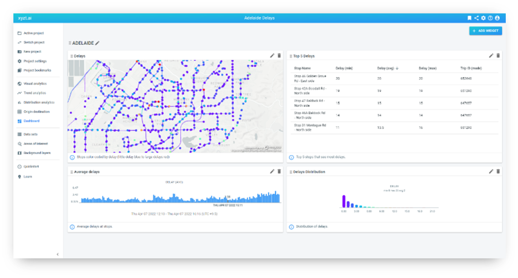
Using the table view feature, you can create a top 5 or top 10 list that ranks the stops with the most
delays or streets with the highest number of accidents or whatever value you’re interested in.
You can also create a table widget to add it to your analytical dashboard or export the table as a CSV
file.
Learn more about creating a tabular view on your data.
Book a demo now and see for yourself why table views and top 10 lists are so useful to get more out of your data.
2. Filter creatively and precise on time
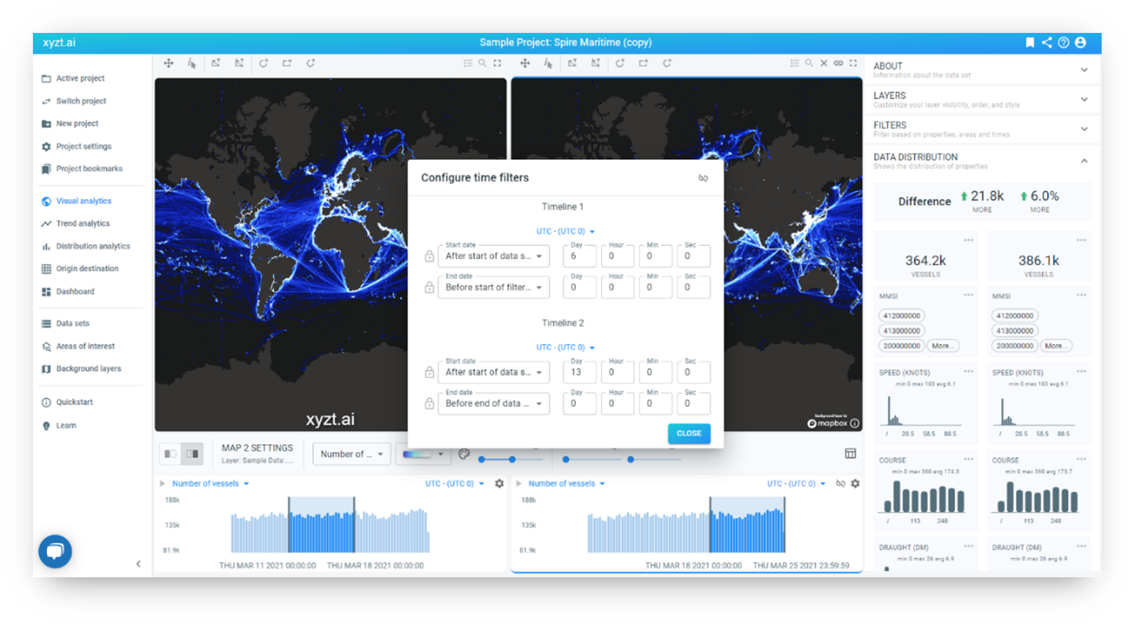
The extended temporal filters benefit the user to perform more precise and creative analysis
through
- Absolute and relative temporal filtering
- Comparisons of two timelines with the absolute and relative filter options
Absolute temporal filtering helps you to select a specific day and timeslot.
Relative temporal filtering enables you to specify a time range with respect to the end time of the
data, which is honored and updated when new data is ingested in the platform.
These benefits create possibilities for you to get creative and build widgets and dashboards that
always report on the last hour, last day, or last week of data.
When using the Split View analysis tool on the platform, you can now gain insights by comparing
timelines and applying the absolute and relative temporal filtering.
Learn more about enhanced temporal analysis and how to create constraints and comparisons.
Book a demo today and discover how creative and precise temporal filtering uncovers new insights.
3. Filter your data instantly based on 4 informative values
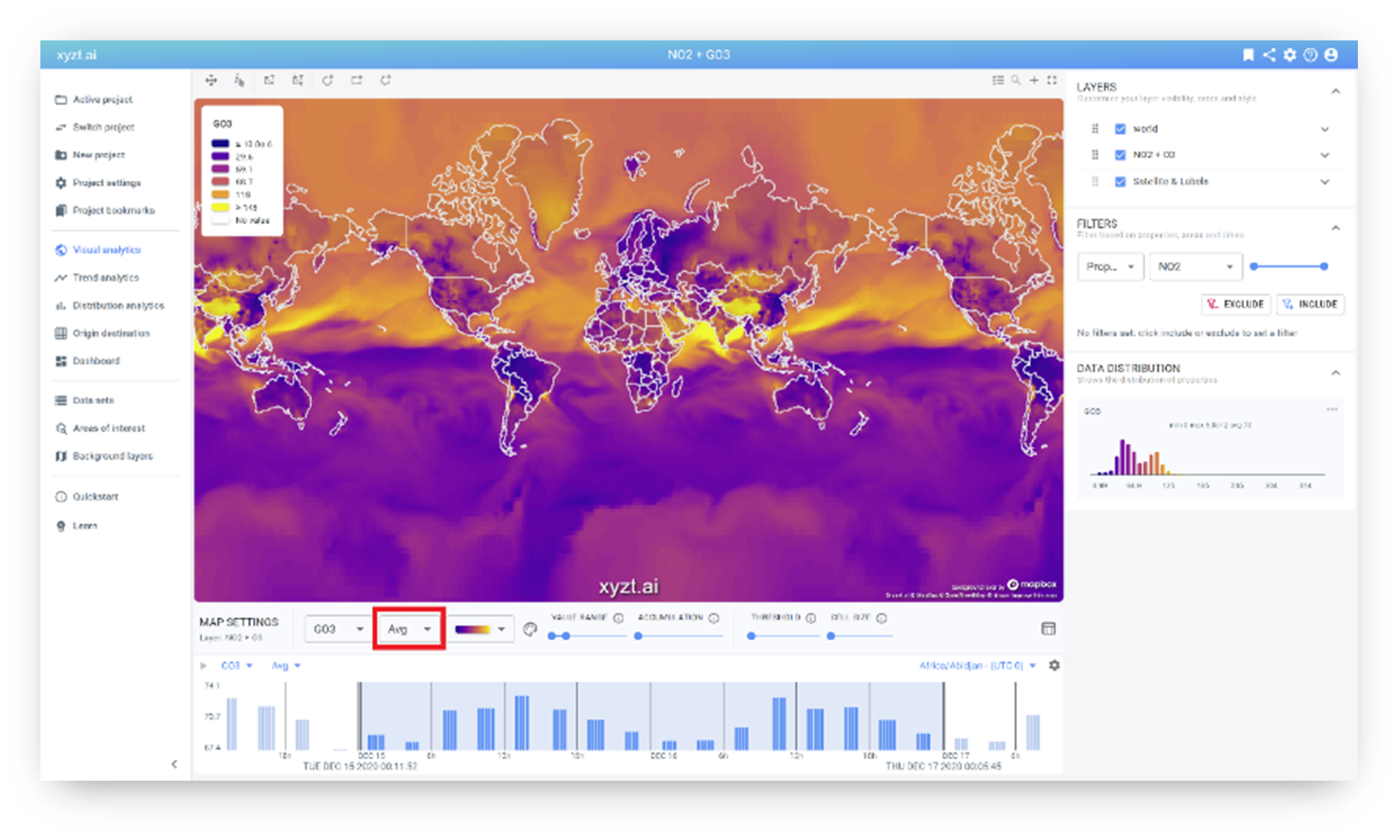
Refine your analysis by choosing between visualizing the minimum value, the maximum value, the
average value, or the mode, which is the most commonly occurring value.
When working with spatio-temporal data, you want to avoid taking a decision based on a single or
just a few measurements.
This new benefit helps you to instantly visualize numeric properties in your data based on the Min/
Max/ Avg/ Mode value filters.
For example, when analyzing Ozone (GO3) over time, it makes sense to look at the average pollution, but also at the minimal, and maximal over the selected time period.
4. Embed external widgets in your dashboards with iframes
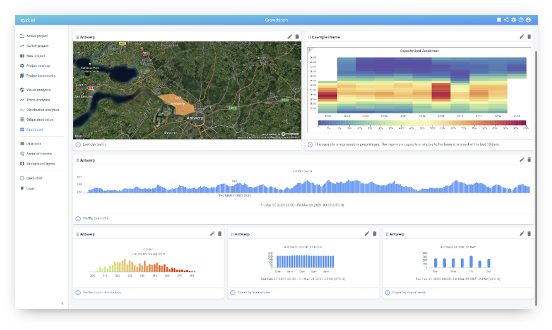
Improve your data stories and analytical reports by embedding external web pages and widgets
onto the dashboard of the xyzt.ai platform. This is easily done by embedding an iframe in a custom
HTML widget.
This new user benefit helps you to bring together information from multiple platforms in a single
interactive dashboard that can be accessed by your colleagues or shared externally via shared links.
5. Improved customization of dashboard layout
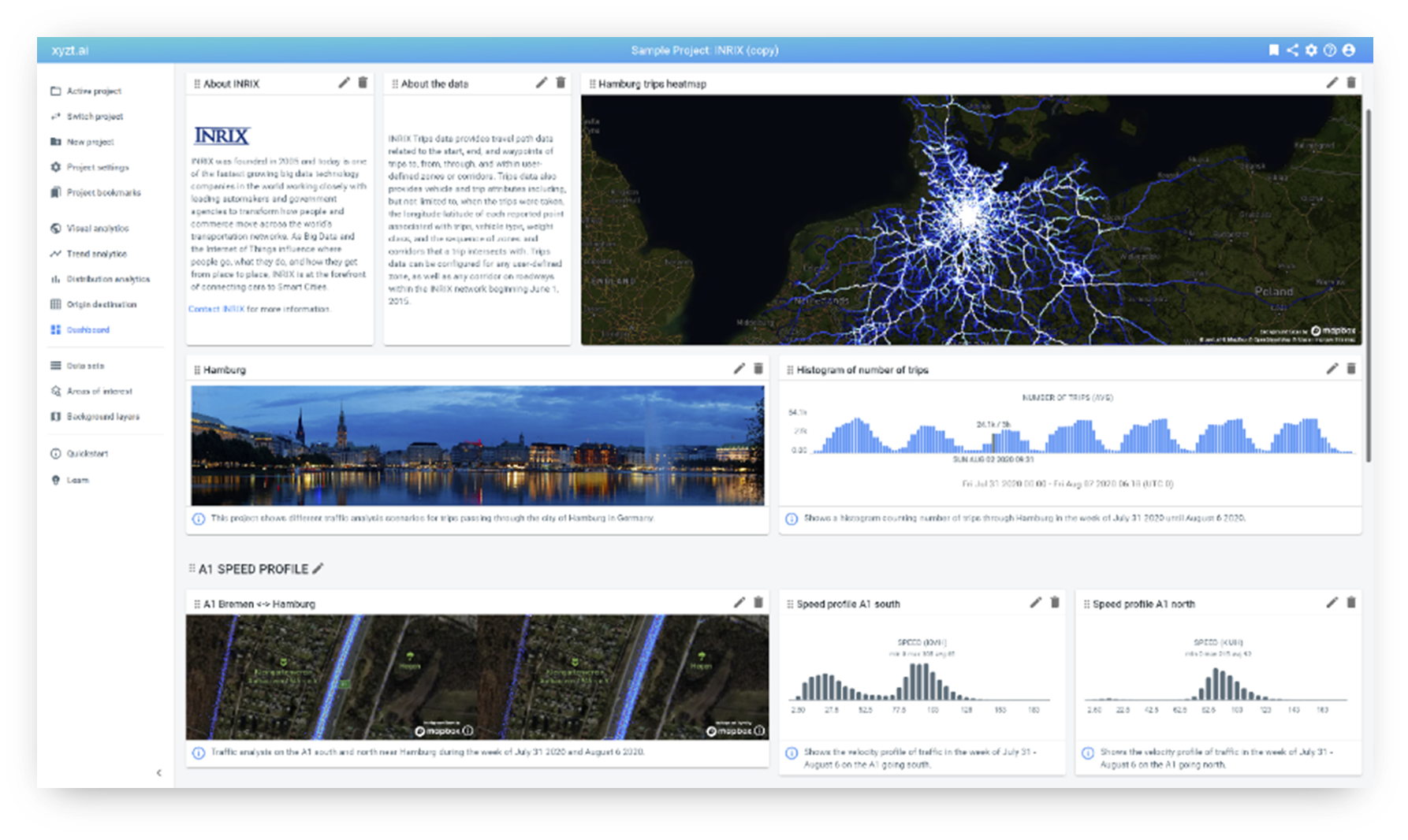
This new capability benefits you to customize the width and height of widgets to create beautifully
aligned dashboards, including large maps and timelines.
Just as before, you can share the dashboard with people inside and outside your organization through shared links or an embed code.
Learn more about the art of building dashboards.
Book a demo today and discover the potential of creating analytical reports and sharing it with anyone you like.
