Deliver your mobility data insights in a convincing way
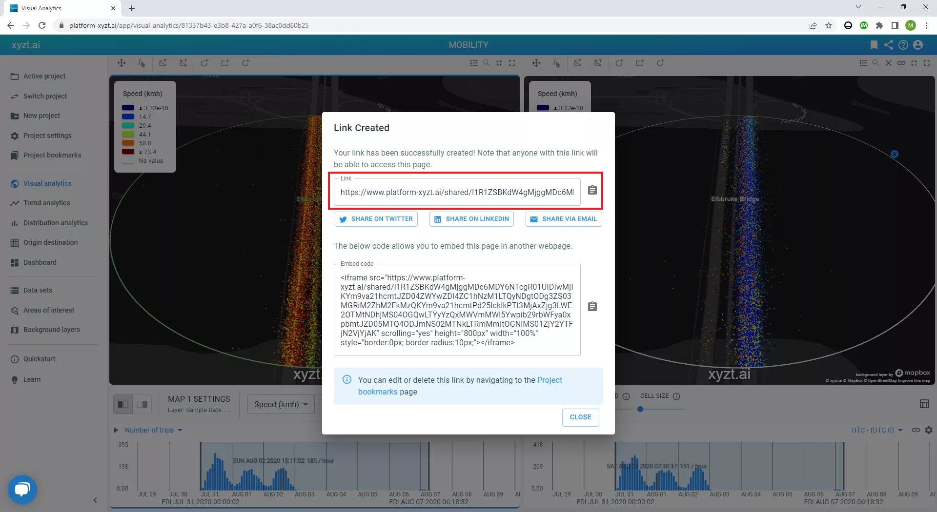
Did you know you can interactively share your mobility data insights and reports with anyone by simply clicking one button? By leveraging powerful mobility analytics software, you can generate a special link to share your data visualizations, dashboards, or any analytical discovery with colleagues, prospects, the press, or with anyone you like.
People understand things a lot better and faster if we present them in a visually appealing way.
When you share your special link with a customer, your followers, or stakeholders, you invite them on the analytical platform you have used to discover your mobility data insights and construct a data story.
This means whoever clicks on the special link will be able to interactively navigate the data and observe the analytical reports as if they were a user of the platform themselves. For example, they will be able to zoom in and out on the heatmap, filter the timeline, and apply some other filters.
However, necessary limitations are in place to protect the original user and keep the focus on what was initially shared.
Instantly share your insights from any use case
Now let’s have a look at what the sharing of insights looks like when using a mobility analytics platform.
For this example, we will go through a traffic management use case with floating car data provided by leading mobility data provider INRIX.
The goal is to analyze speed profiles and identify congestion problems at a busy bridge connecting the inner city with the outer city of Hamburg, Germany.

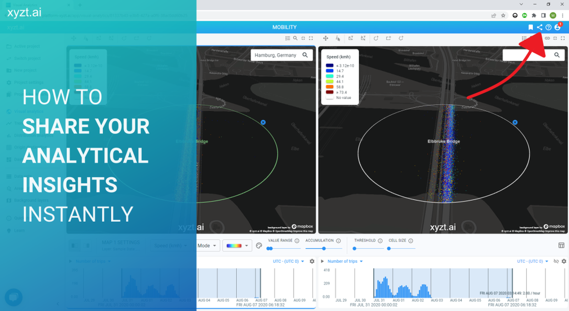
If you click on the picture or here, then you will be invited onto the platform. You will be able to experience the shared link feature and navigate this use case yourself. Have a look!
The following filters are in place to specify the traffic congestion use case.
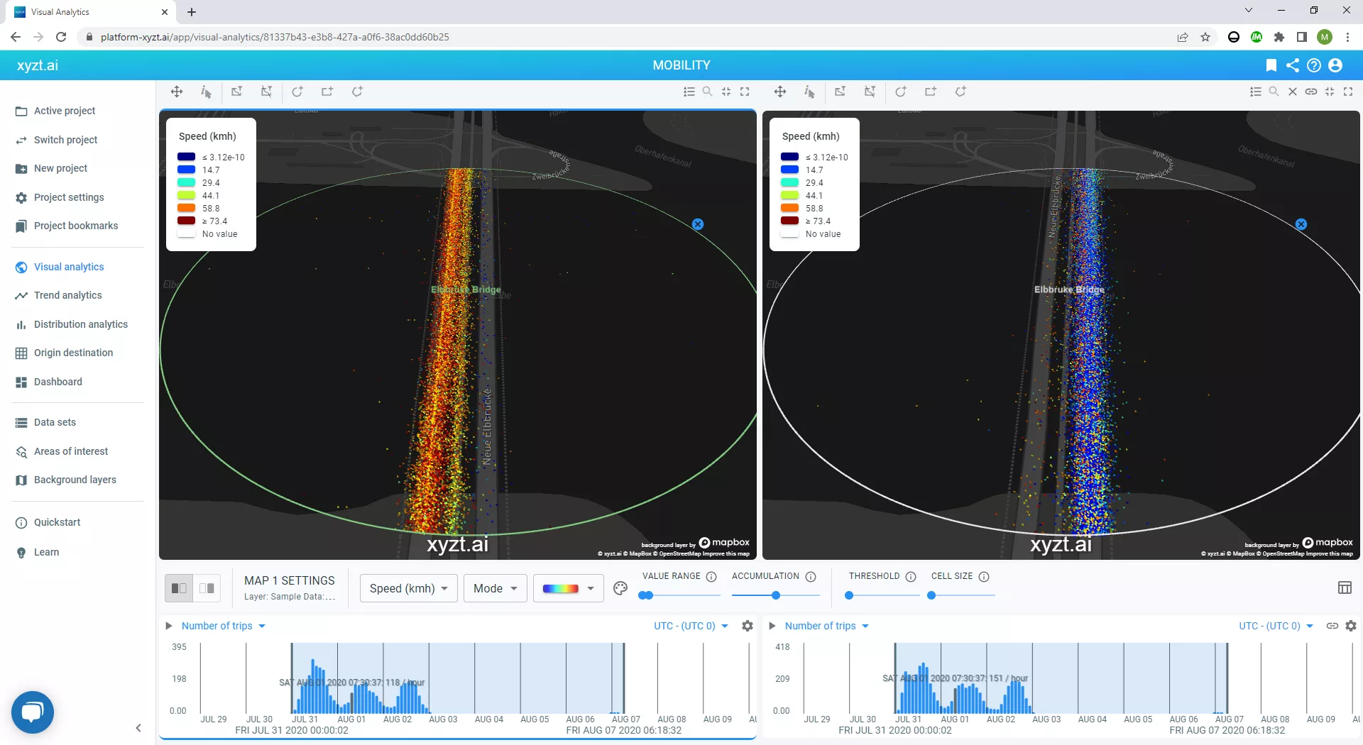
- Area of interest. The circle indicates the area of focus. We don’t need to see any other data, as we are occupied with traffic activity on the bridge.
- Heading. We have split our map into two heatmaps. The left one only displays vehicles coming from the center and moving to outside the inner city. The heatmap on the right only shows vehicles coming from outside the inner city and moving to the center.
- Time. The total time range of this data set is one week. From Friday until Friday. I have selected to only show weekend activity. Therefore, the platform only displays traffic activity from Friday, Saturday, and Sunday.
The heatmap on the left is showing dominant orange and yellow colors while the one on the right is showing dominant blue colors.
The map legend indicates the value of the colors we are seeing on both heatmaps. Orange and yellow indicate a speed somewhere between 45 -75 km/h, while blue equals a speed of 15 km/h and lower.
Conclusion
We conclude that, during this week of data, traffic was heavily congested on the bridge during the weekend for vehicles moving into the city. There was no congestion for vehicles moving out of the city during the same time range.
This insight highlights a problem. Possible next steps could be identifying if this is a recurring pattern and following the traffic flow to identify where the vehicles are originating from.
Mobility data insights, such as this one, and many other analytical discoveries and reports, such as dashboards, can be easily created and instantly shared using powerful mobility analytics software.
It takes one click to generate a special link you can share with anyone you like. People can’t access your data and if you deactivate the link, nobody will be able to see your data visualizations and analytical insights anymore.
If you want to learn more about creating analytical reports and the possibilities of big data analysis, click here.


