It’s a problem not unique to data analysts. As a developer, I often struggle with the same: you create some awesome new functionality, but nobody except yourself seems to understand the UI to use your new feature. If nobody understands or knows how to use it, you might as well not have done the work.
5 rules for data-driven styling using colors
When showing data on the map, one of the important aspects is your choice of colors.
A good color choice will not only look nice but also make the reader nod in agreement. Pick the wrong colors and you can expect any reaction between mild confusion to swearing aloud.
For myself, who has the artistic skills of a one-year-old who just discovered his first set of crayons and a freshly painted white wall, I created a list with some basic rules that I know will result in an acceptable map.
Below you can find the five “rules” I try to follow when I must put data on my maps (drawing everything in shades of pink is not an option).
Rule 1: Use intuitive colors
People automatically associate meaning to colors:
- Green is considered good and red bad
- For elevation data, green means low and red is high
- For temperatures, blue is cold and red is warm
When you’re telling a story, you should take advantage of data-driven styling and you must make sure that the colors on your map are corroborating that story.
Let’s look at the visualization of some car traffic data in the city of Berlin to illustrate this.
Connect meaning to the colors on your map
Imagine you have a website where people can see live data of traffic jams so that they can plan their route accordingly. We can all agree that there are better ways to spend your time than getting stuck in traffic, so in this case, low speeds are considered bad and should be colored red:
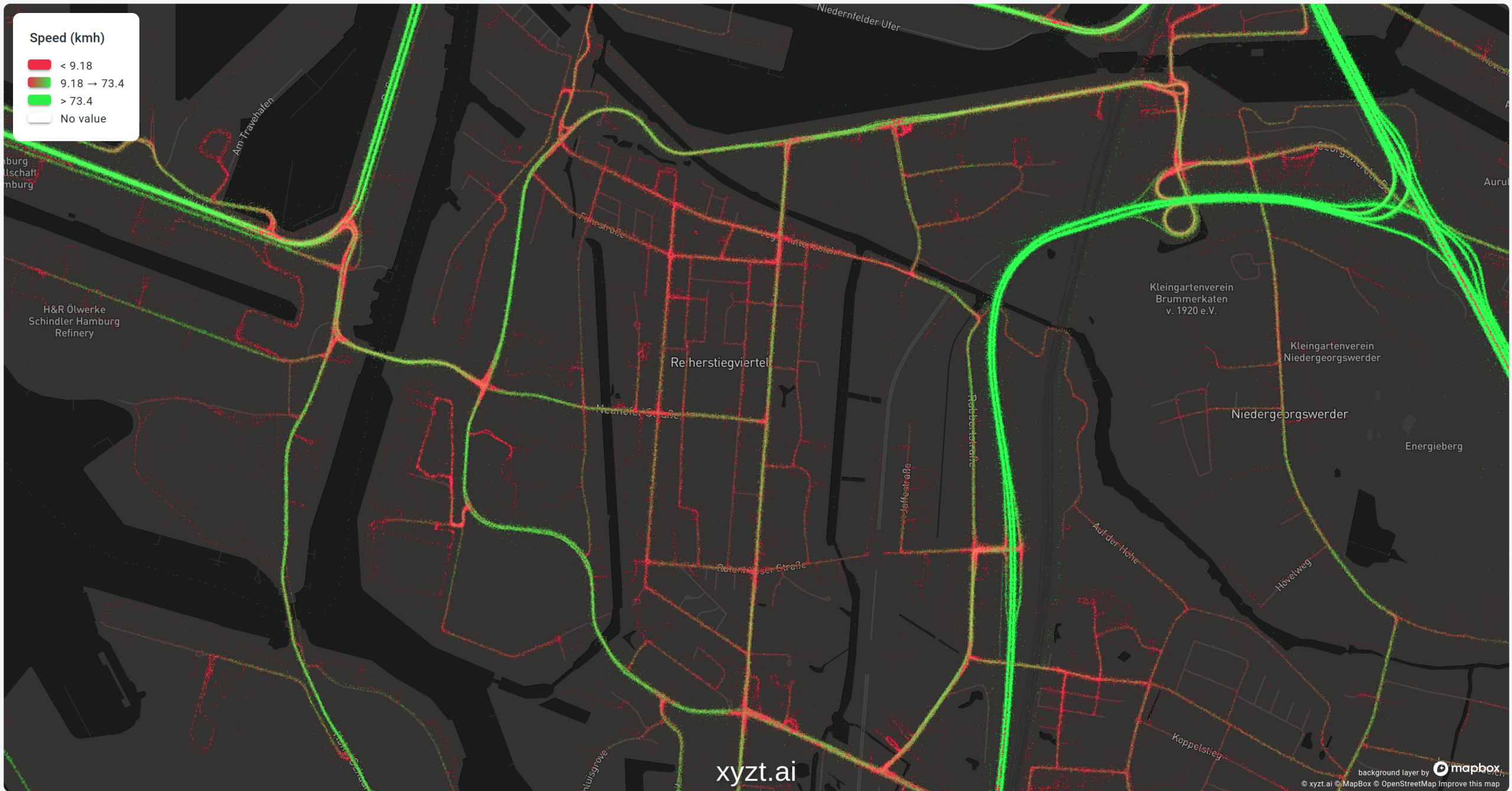
In this case, the primary roads into the city of Hamburg allow for high speeds, while you’re clearly better off walking once you turn away from those roads onto the small city lanes.
However, give that same data to the owner of a website that showcases the best cycling routes throughout the city, and you have a completely different story.
The best routes for cyclists are the ones where you aren’t constantly overtaken by cars driving 70 km/h. In this case, the slower the cars are driving the better. Slow speeds are suddenly good and should be colored green, while roads with fast driving cars should scream “stay away from here with your bike at all costs”.
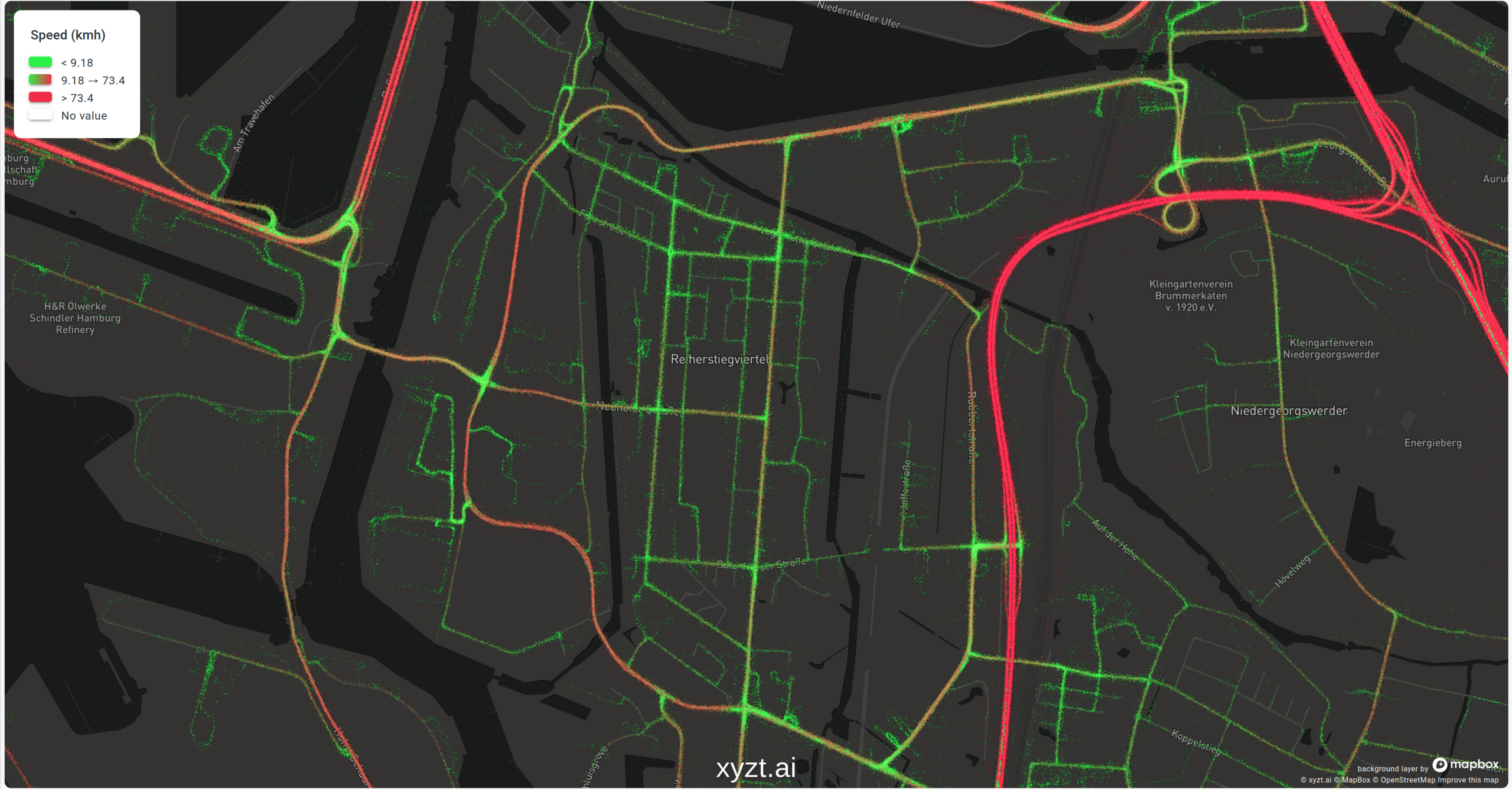
Same data, same area, but a completely opposite color map to ensure that the colors and their associated meaning match the story we’re telling.
Rule 2: Use smooth changing color maps for continuous values
When you’re plotting a continuous value (like temperature, velocity, humidity, …), you should stick to a color mapping that also changes smoothly in order to efficiently make use of data-driven styling.
And the opposite is true as well: if you’re visualizing categorical data where the categories are independent, don’t use sequential colors but rather diverging ones. An example of such categorical data would be the vessel type (fishing boat, cargo ship, oil tanker).
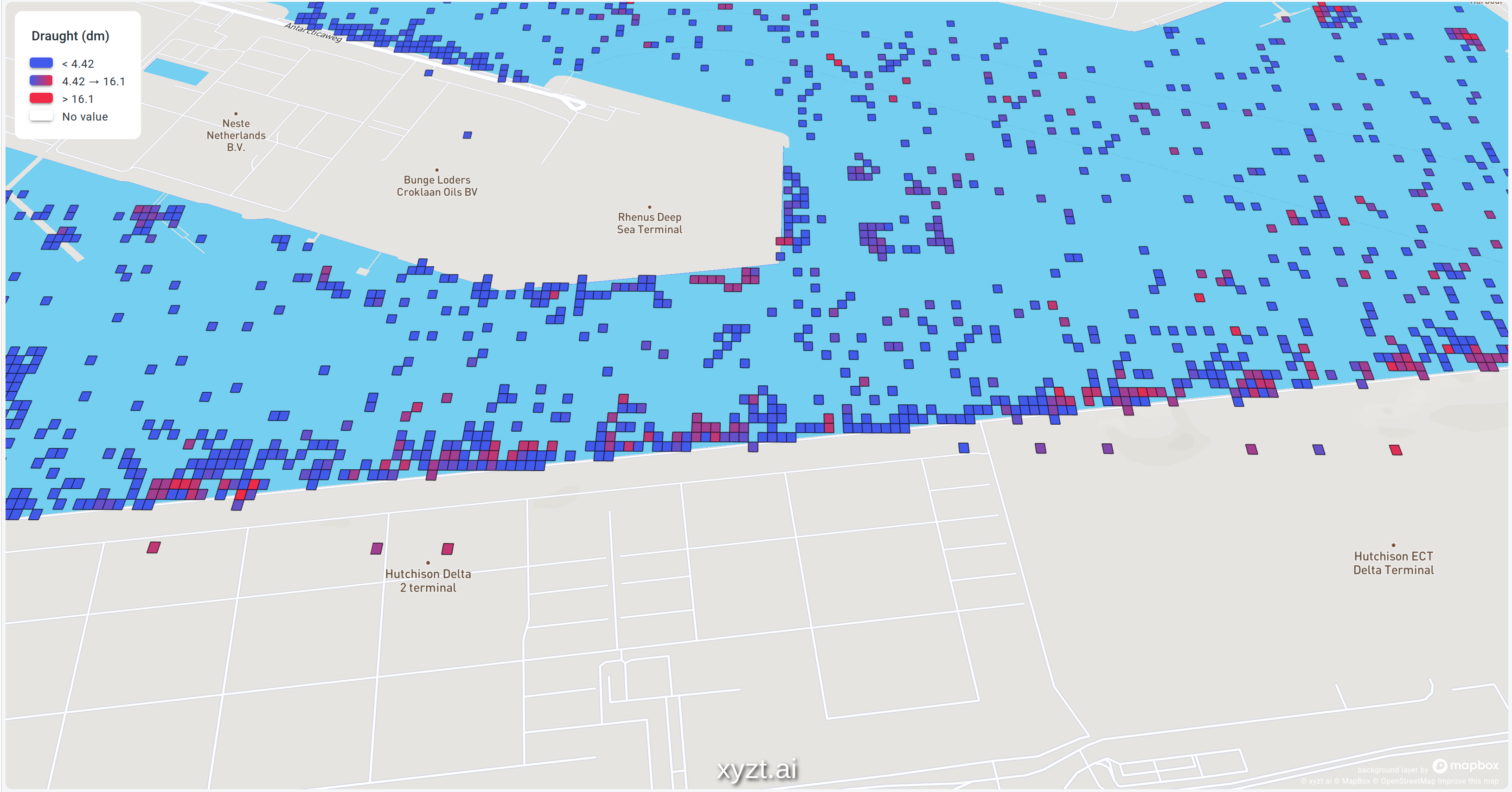
To illustrate this, let’s first look at a map where I violate this rule. The map shows maritime data in the Port of Rotterdam, and I visualized the draught of the ship. For those of you not familiar with nautical jargon: the draught of the ship is the distance between the waterline and the lowest point of the ship. A rather important measurement if you want to avoid running to the ground and blocking a whole channel or port entrance.
Instead of using a sequential (gradient) map, I poorly opted for a “rainbow” color map because I thought it looked pretty.
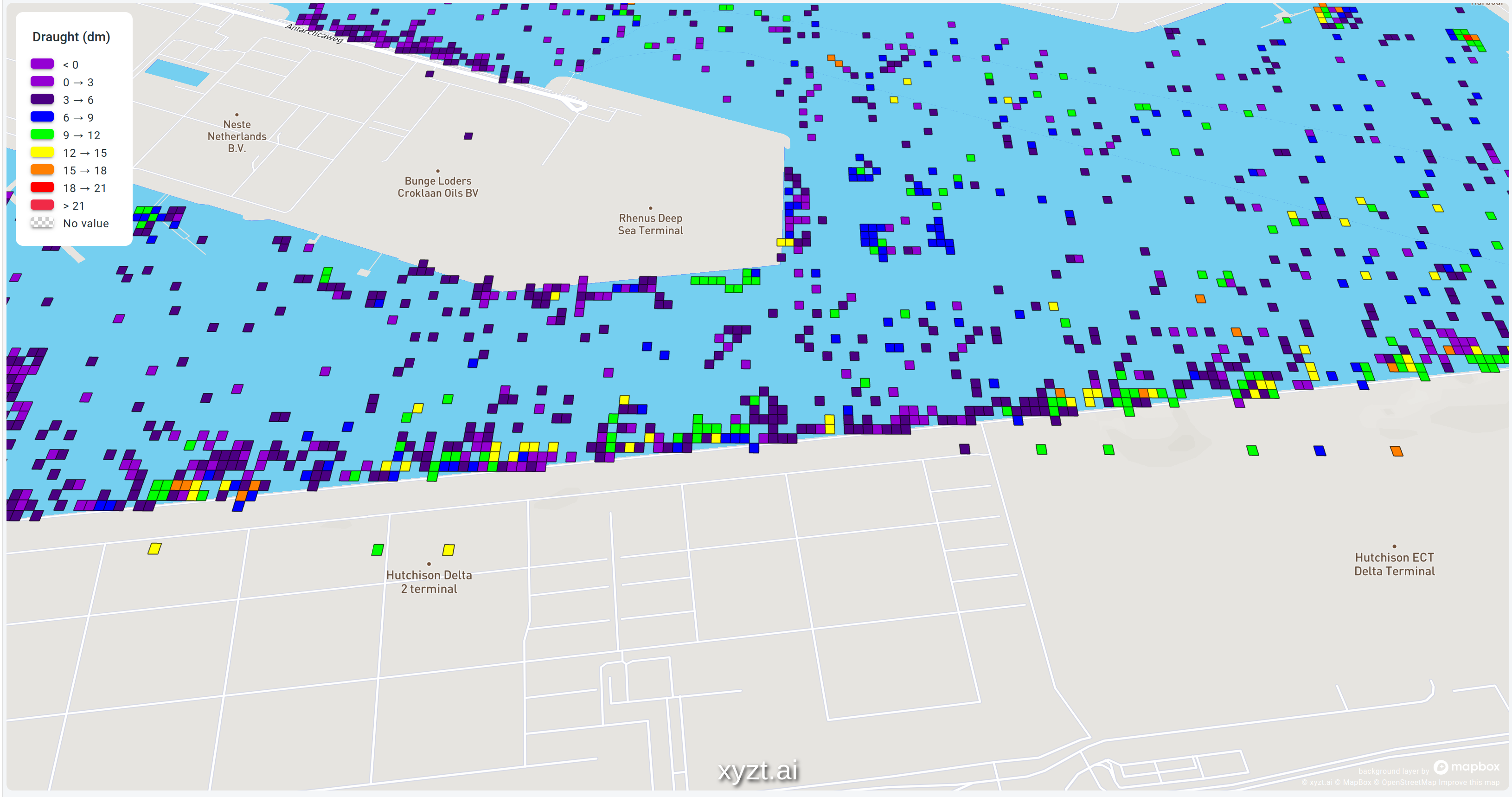
This rainbow color map with its distinct colors causes 2 major headaches:
- It’s impossible to tell which color represents large or small values without looking at the legend. This is a clear violation of the “use intuitive colors” rule.
- It’s also very hard to tell what the difference is between values. Is the difference between yellow and blue greater than the difference between green and yellow? Or is it the other way around? Again, you will have to study the legend and conclude that despite what the colors suggest, the difference between yellow and green might be smaller than the difference between two green dots.
These problems would go away by choosing a sequential color map. See the picture below.
Same data, but this time I opted to style the data using a gradient color map going from blue to red. This makes it easy to compare ships and instinctively you know that the closer to red, the higher the danger to get grounded (rule one in action).
Like any good rule, there is an exception to this rule which brings me to my third rule.
Rule 3: violate rule 2 when not all values are considered equal
You can throw away rule 2 when some values have a special meaning. Let’s look at an example to see what I mean with values with a special meaning:
When looking at the speed cars are driving in a city, we could apply data-driven styling by using a gradient color map from blue to red to give us an idea of where the traffic rides fast and slow. This is exactly what I did when explaining rule 1.
However, not all speeds are equally important. Suppose the city is divided into zones with a maximum speed of 30 or 50 km/h. Outside the city, you’re allowed to drive faster.
In a 30 zone, the absolute difference between people riding 25 and 27 km/h and people riding 29 and 31km/h is both times only 2km/h. However, when you consider that this happens in a zone with a maximum speed of 30km/h, the difference between riding 29 and 31km/h becomes more important.
Keep the context of your data in mind
Here it makes sense to switch from a continuous color map to one with a few distinct colors. For example:
- A color for all speeds below 10 km/h: these are typically people parking their cars or stopping at traffic lights
- Speeds between 10 and 30 km/h
- Speeds between 30 km/h and 50 km/h
- Speeds over 50 km/h
This makes it very easy to spot dots on the map where people are driving above the maximum speed.
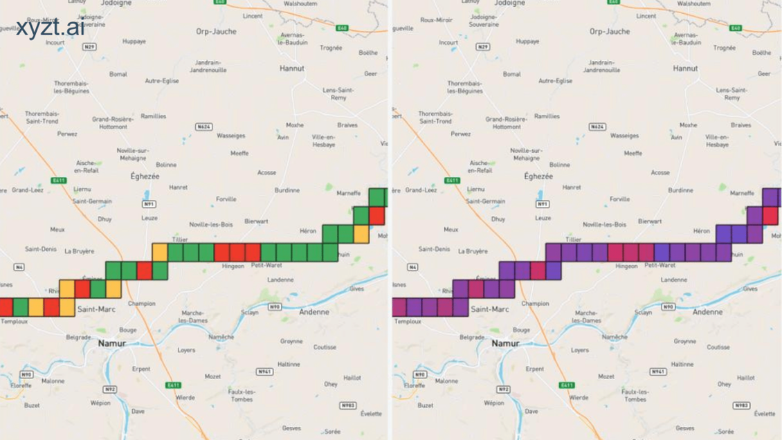
This is exactly what is shown on the map below, but on a highway in Belgium with a speed limit of 120 km/h. The map visualizes the speed the cars are driving:
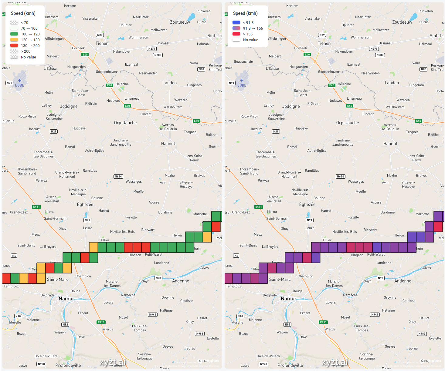
In the image above on the left side, I opted for:
- A very light green color for speeds between 70 km/h (the minimum speed on a highway) and 100 km/h. As there are no sharp turns or steep hills on this stretch of highway, nobody is riding at these speeds. It also means that we found a rare moment when there were no traffic jams.
- Solid green for speeds between 100 and 120 km/h. These cars are riding close to the speed limit, but stay under it.
- Orange for cars close to the speed limit, but alas just on the wrong side of it
- Red for cars that are way over the speed limit and that would be in serious trouble when stopped by police.
Compare that with the gradient-based colormap in the image on the right, where it’s much harder to retrieve this information. You can still see the areas where the cars drive the fastest, but it’s not so easy to tell whether they are speeding or not.
Rule 4: Only color the data you’re interested in
When you’re only interested in a subset of the data you’re visualizing, try to either completely filter out the non-relevant data or else make sure to color it in such a way that it doesn’t distract.
In the following example, both maps show the same maritime dataset. One of the properties in this data is the vessel or ship type (a fishing boat, a cargo ship, a pleasure craft, …).
When you need to report on tankers and cargo ships only, it’s best to leave out all those other ships. Otherwise, readers of your map will have a hard time filtering the relevant information from the irrelevant ones. This is illustrated in the picture below.
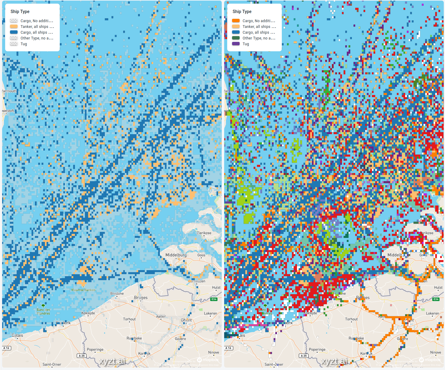
In the image on the left, all the other ship types are still drawn on the map but in a semi-transparent light grey. You can see them, but they don’t distract from the important Tanker and Cargo data.
Compare that with the image on the right-hand side. The tankers and cargo ships are still colored in the same colors, but due to the colors used for all other ship types, it’s a lot harder to spot them and focus on them.
Rule 5: Use a tool to select your colors
While the previous rules help you in determining the properties you’re looking for in your colors, you still need to pick a set of colors.
Here I just admit to myself that whatever colors I pick, they will be worse compared to what a dedicated tool can do. Those tools will take care of all the other things that are so hard to get right:
- Picking color blindness friendly colors
- Choosing colors that are different enough from each other but still look visually pleasing when used together on the same map
- Picking colors that work well when printing
Coloring tools to enhance data-driven styling
My preferred color-generating tools are ColorBrewer and Colorgorical.
For example, in ColorBrewer it’s very easy to say whether you need sequential or diverging colors, the number of colors, whether the colors will be printed or only viewed on screen, etc. Once you’ve configured all those settings, it’s only a matter of copying some color codes and your map looks beautiful and understandable.
Conclusion
By sticking to a few easy rules, everybody can present data on a map in an understandable way. It’s only a matter of:
- Use your knowledge of your data properties to pick the settings of your color map (sequential versus diverging). See rule 2 and 3.
- Reduce the visual clutter by hiding the non-relevant data (rule 4).
- Don’t surprise your reader by sticking to intuitive colors, e.g., red is bad and green is good (rule 1)
- Use the knowledge of experts by letting a tool like ColorBrewer select the colors for you
Data-driven styling customized to your needs
Of course, our xyzt.ai platform offers all the options you need to style your data following these five rules.
Recently, xyzt.ai upgraded the visual analytics platform by releasing new features that enhance multiple functionalities, including various options to style your data as you see fit. You can read up about the new features or schedule a demo to find out more.