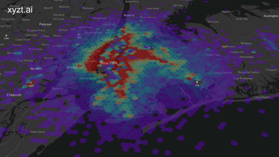
Let’s mix things up a bit and engage in a thought experiment. Your name is Mike. You’re 36 years old and you live in New York City together with your wife and two children. You have a steady job, but you have been wanting to remodel the house for a while and could use some extra money. So, you decide to start a side hustle and become a taxi driver during the weekend.
However, you have an electric car and you’re still a family man that likes to spend time with his kids during the weekend. Therefore, the ideal scenario for you is to drive short distances during the evening. But what would be the ideal location for you to operate in? How do you know how to maximize your time and income?
Let’s have a look at how we can extract value from time series data and how we can analyze it to help Mike identify the best places for his side hustle. Even though it’s unlikely Mike would perform time series analysis, this use case is particularly interesting for taxi and ride-sharing companies, and serves as a demonstration how to discover valuable insights from time series data using the xyzt.ai platform.
Interesting in combination to this article is our mini book “The Connected Taxi”, which talks about how automotive and mobility companies can add monetization strategies to their taxi and ride-sharing operations.
Before we dissect the interesting taxi hotspots of New York City, let’s make sure we understand what time series data means!
What is time series data?
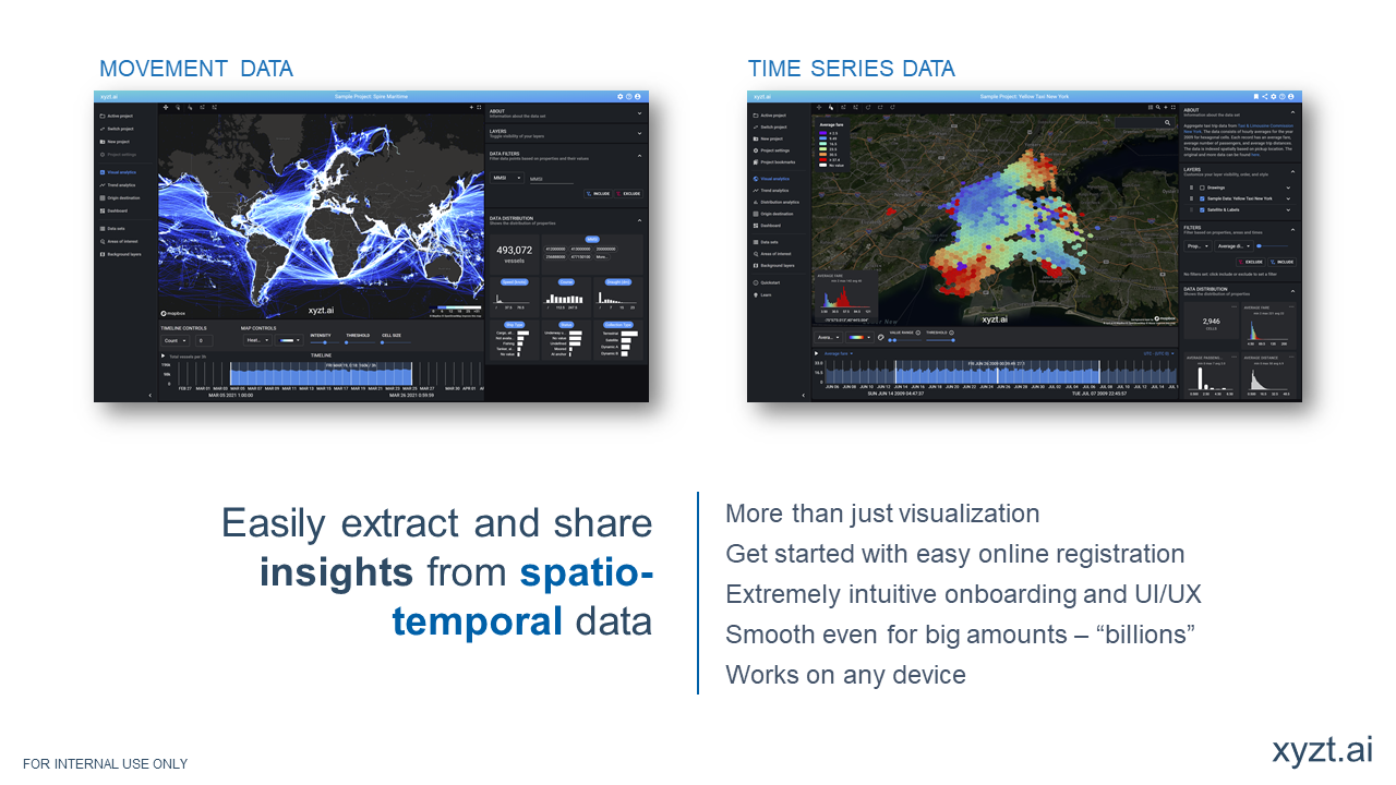
Time series data is dynamic information captured from a static location. The dynamic data changes in attributes over time, but the static location remains a fixed source. For example, this fixed source is often a sensor on the road, such as a camera, capturing how many cars are passing by and at what speed. In other words, time series data enables the user to analyze changing data defined from a fixed location.
How is this something new for xyzt.ai?
xyzt.ai’s focus has always been to provide location analytics at scale. Previously, our location intelligence platform only visualized and analyzed movement data. Meaning, location data sourced from assets that move around. This could be a vehicle, plane, vessel or even a smartphone, but in all those cases the actual source capturing the data is in motion. With time series data, the source is defined at a fixed location.
Analyzing time series data
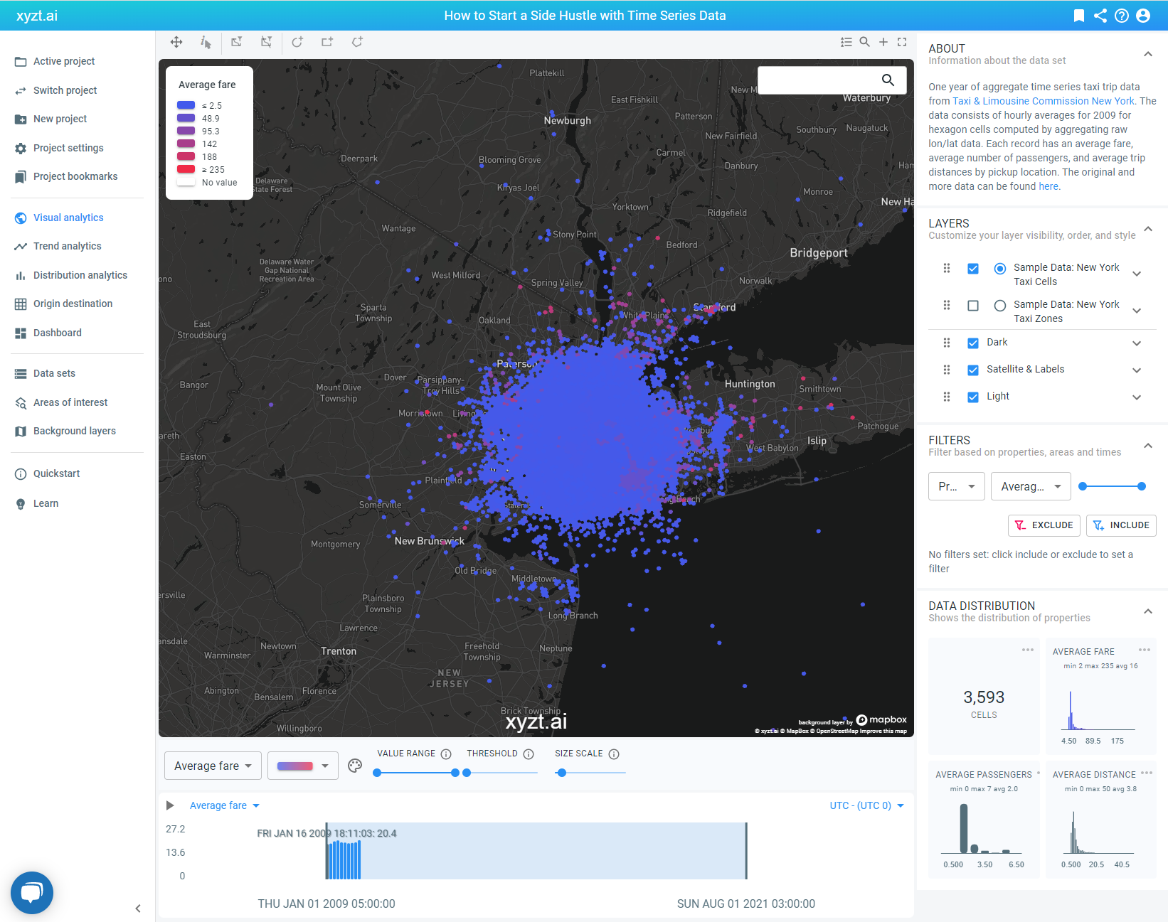
To help Mike reach his goal, we have downloaded a trip data set from the New York City Taxi and Limousine Commission (TLC) that provides us with a year’s worth of data about taxi usage in NYC, including average fare, passenger count, and trip distances. In the picture above, you can see the default view once the data set is uploaded in the xyzt.ai platform.
Now the fun part starts. Data without the right analytical tool to find insights is just noise. This goes both ways. An analytical tool without the right data is like an engine without fuel. Once you have both, it’s a matter of time before you discover what you need or stumble upon something unexpected.
Time series density analysis to identify taxi hot spots
To identify the NYC taxi hotspots for Mike, we’ll filter the data to reflect his requirements:
- Mike wants to drive during weekends
- He also wants to drive during evenings
- Mike has an electric vehicle and therefore prefers short trips
- He wants to maximize his time and lock in high fares
As we’re performing density analysis, we’ll be counting records that pass a filter and consequently plotting those records as a density map, which will indicate the ideal location for Mike to be active. Therefore, let’s change the value for the visualization of the heatmap from the default setting ‘average fare’ to ‘number of records’.
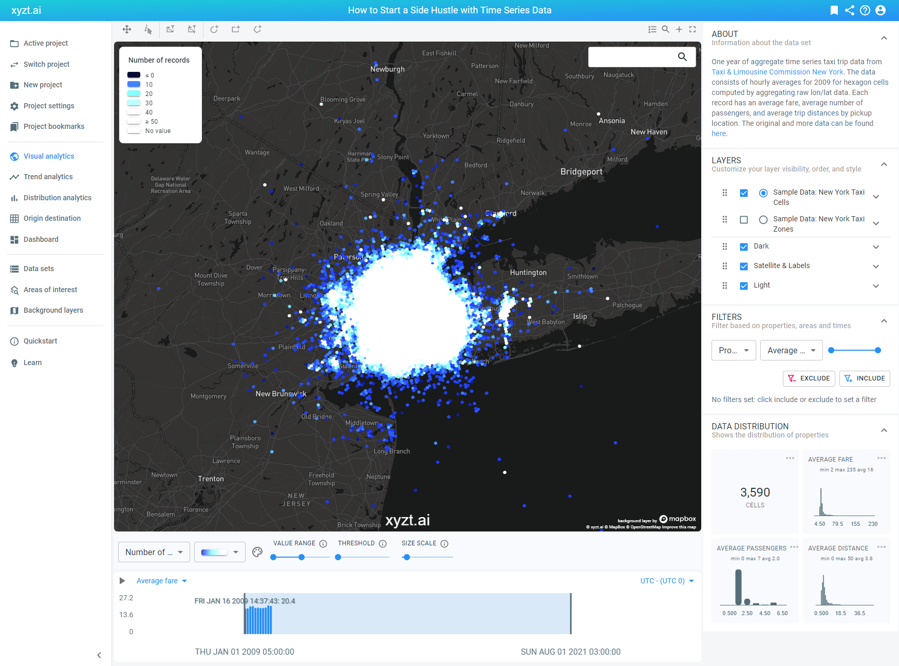
We’re seeing a lot of white that doesn’t say much. This is normal as we’re currently visualizing the data based on number of records and this data set contains one year worth of information. We need to filter it down to paint a more telling and actionable picture.
Mike wants to drive during the weekend, so we’re applying a time filter that only visualizes the taxi activity from Saturday to Sunday. This already eliminates a lot of location records from the total data set.
Next, we’re choosing a different color for the heatmap that best suits this type of data and creates the best color variance to intuitively understand the differences in activity.
We’re also increasing the value range for the number of records. Previously, it was set at 0 – 50. Now, we have extended it from 0 – 100, which enables us to identify the locations with a dense number of records more easily. In other words, the areas with a lot of taxi activity.
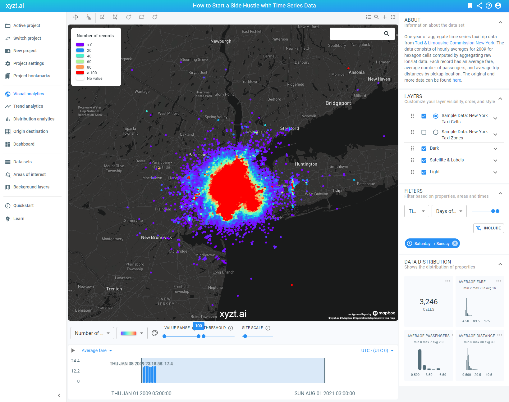
During the weekend, Mike wants to spend some time with his family. Let’s make sure we only visualize what we need to see. This is easily done by applying another time-based filter. Only now, we’re filtering on hours of the day and selecting a range from 18.00 – 23.00 to be included in the data.
Mike drives an electric vehicle. Long trip distances are not suitable for him and could complicate his operations. Therefore, we’ll apply a property filter that defines the average trip distance. In this case, we’ll select a value range from 0 – 2 km.
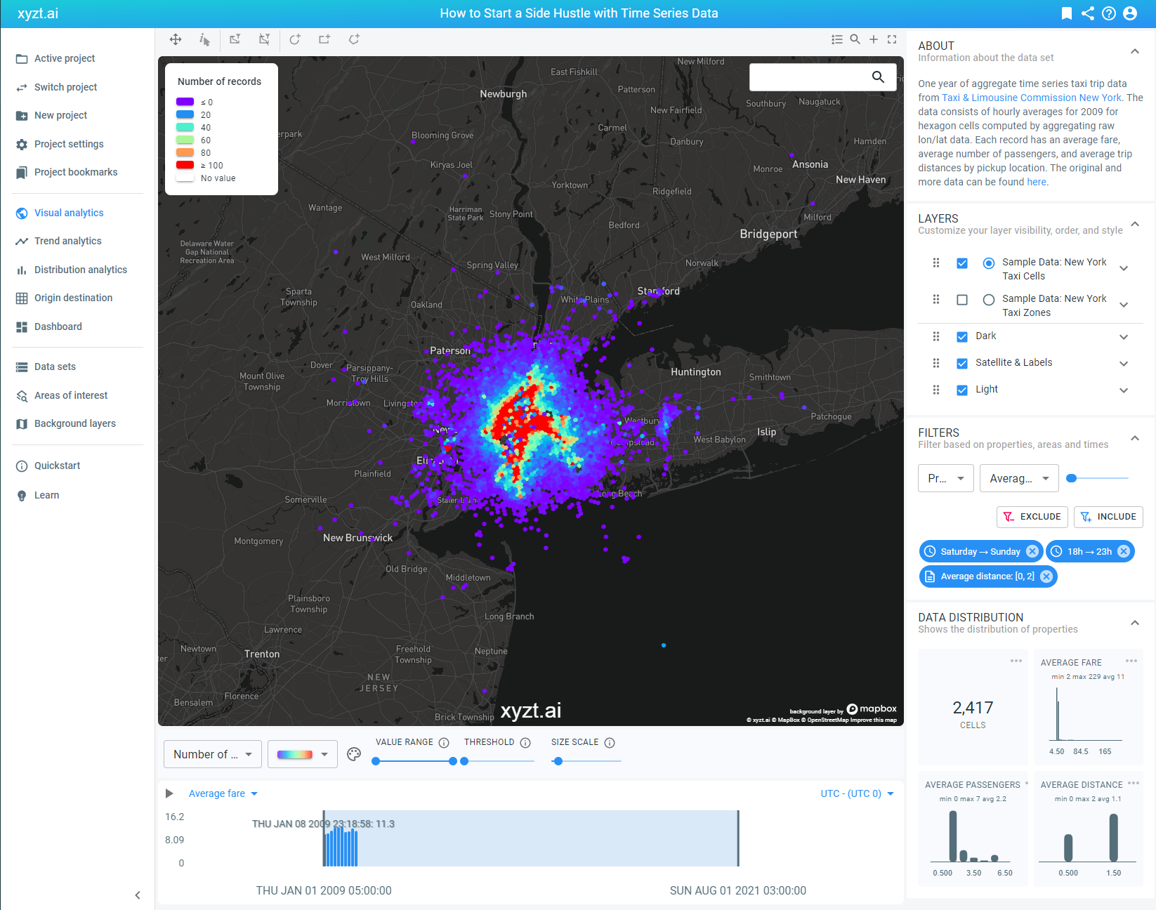
A quick summary on our current time series data analysis. We have visualized the data based on number of records to be able to easily identify the areas with high taxi activity. Because it’s a one year data set showing a lot of irrelevant information for Mike his goal, we have filtered down the noise to signal ratio by only visualizing taxi activity displaying a short average trip distance made during weekend evenings.
Now that these filters are in place, we have a more select area displaying a high number of records. If we zoom in on the map, we see that Hoboken and Lower Manhatten indicate a concentrated place with a high number of location records. Therefore, this area would be a good place for Mike to start the side hustle.
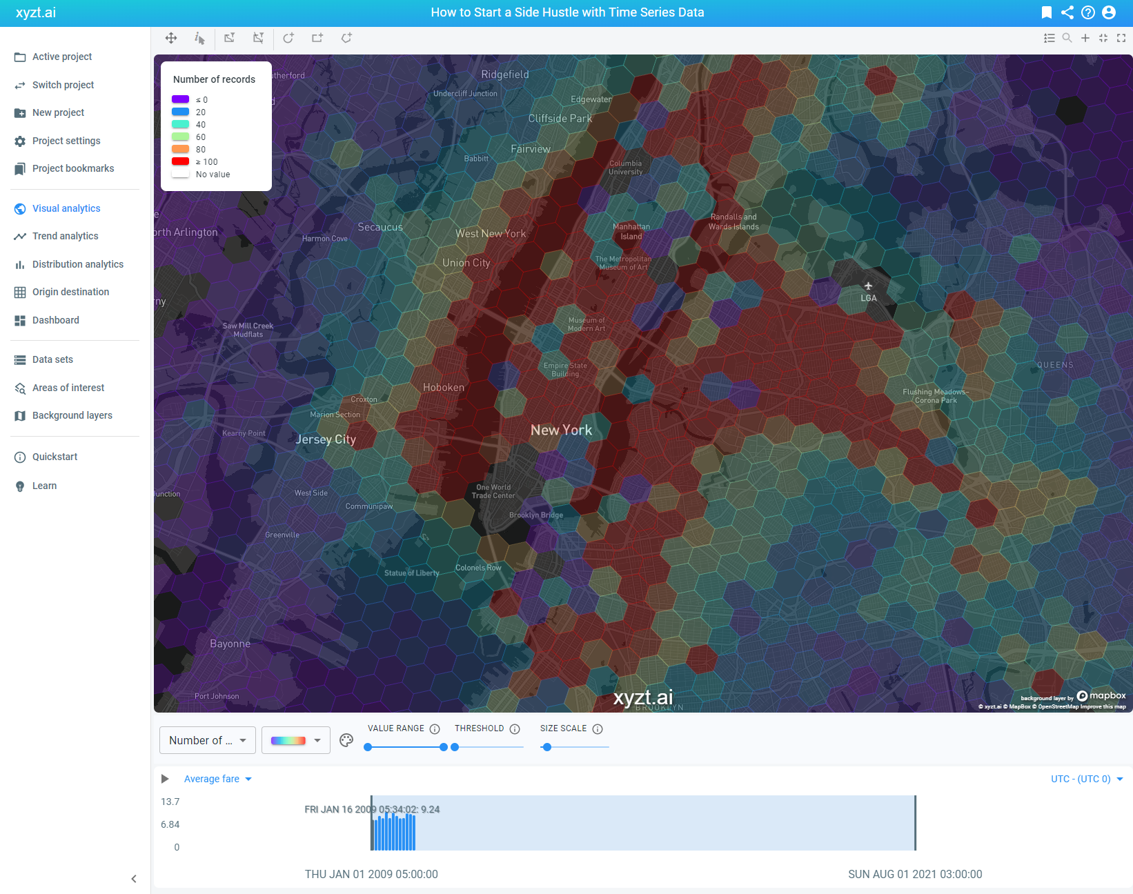
By increasing our threshold filter, we can choose to only visualize the records that are equal or above the threshold value. By sliding it to the maximum, we only see the data that represents a high number of location records.
To finalize our analysis, we need to inform Mike which areas displaying a high number of records also reflect a high average trip fare. After all, he wants to maximize his time and be active in a busy area where people pay the most for a short ride.
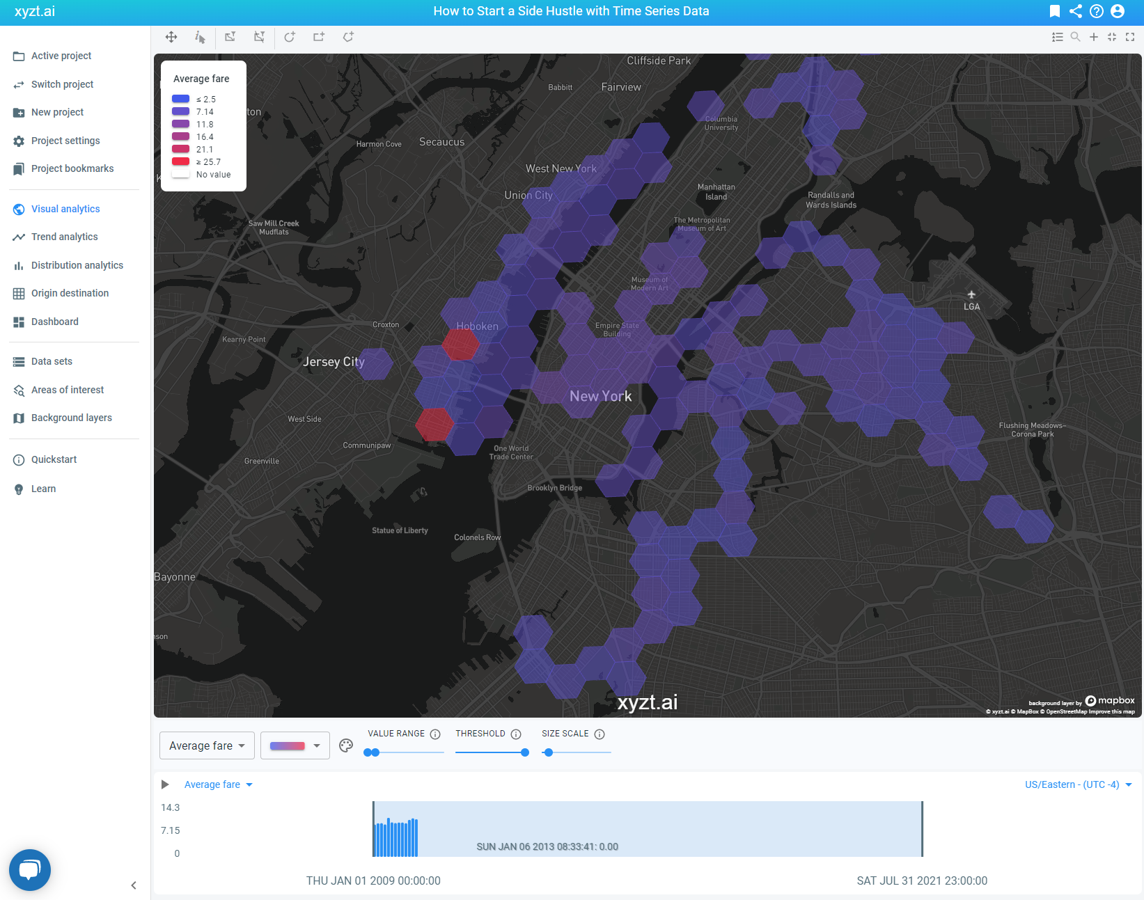
Now that we have identified our interesting areas, let’s change the visualization value from ‘number of records’ to ‘average fare’. This will change most of the previously red colored cells, indicating a high number of location records, to purple colored cells. We notice there are two red colored cells.
As we have now filtered the map on ‘average fare’, those two cells represent location records with a high value for our chosen filter. In other words, these cells represent an area where people pay a high average fare for a short trip and where there is a lot of taxi demand.
The red cells on the image below are the ideal area for Mike to start his side hustle and maximize his time!
Get in touch with us
Interested to know more? Schedule a demo with us today.
