During the mobility analytics webinar, Bart Adams, CTO & Founder of xyzt.ai, a location intelligence platform, explains together with Holger Hochguertel, Director of Sales and Business Development at INRIX, a leading company in the mobility industry, how big data in combination with an analytics tool offers a realistic pathway to revolutionize the way we move, make mobility smarter, cleaner, and safer.
You will learn about:
- Three concrete use cases to implement smart mobility strategies in an urban environment
- What INRIX trips data is and how it can be used for traffic and mobility analysis
- How smart and sustainable mobility can be implemented
- How the xyzt.ai platform accelerates times to insights from months to minutes
If you would like to re-watch the webinar, you can sign up for a copy or scroll down to catch up on the highlights discussed during the xyzt.ai and INRIX webinar.
How to achieve smart and sustainable mobility
According to the World Health Organization, air pollution is one of the biggest environmental threats to human health. Road traffic is the main source of two of the most harmful pollutants, nitrogen dioxide and atmospheric aerosol particles. All transport modes and networks need to become more sustainable and smart.
Mobility and transport have an effect on us all. How we commute to work, visit family and friends, travel abroad, or order packages and last-mile deliveries from the internet. All of these transportation modes influence our social life and the global economy.
Even though, the last two years have been vastly different due to the corona pandemic and work-from-home policies, we are still stuck in traffic, wait in line to enter a metro or train, and experience severe disruptions in the global supply chain. However, there exist many technologies collecting and aggregating location data from all types of mobility sources: from vehicles to electronic steps to smartphones and more. For many cities and companies, these vast and valuable amounts of data remain untapped resources that are either directly available through their own database or can be bought in minutes thanks to data providers, such as INRIX.
“It takes on average 3 months for our data scientists to start extracting insights out of movement data. With your tool we could do it in half an hour.”
VP of Data
Having the data is one part of the equation. Understanding and learning from that data is the second part. The xyzt.ai platform is a location intelligence solution that is able to leverage these untapped resources and transform the huge amounts of abstract data into concrete and actionable insights. The platform is built as a self-service analytics tool with an emphasis on its ease of use and eliminating the need for expertise knowledge or complex integrations. All you need is location data.
Three urban use cases to implement smart and sustainable mobility
Obtaining mobility insights is easy once you have your data ready to be fueled into the analytics engine of the xyzt.ai platform. You can start analyzing in four steps. Connect your mobility data, define your areas of interest, start exploring by visualizing and analyzing the data, and take action by building up analytics reports.
Below we’ll discuss the following three urban use cases to illustrate the power of big mobility data in combination with a self-service analytics tool. We’ll demonstrate how a data analyst can perform traffic analysis to achieve smart and sustainable mobility strategies by using trips data by INRIX and the xyzt.ai location intelligence tool.
- Velocity profiles and congestion areas at the Elbbruke bridge in Hamburg, Germany.
- Speed profiles in neighbourhoods close to the schools of Brussels, Belgium.
- Traffic flow after a detour as a result of an unusable bridge in Lüdenscheid, Germany.
Before we dive into the use cases, let’s make sure we have a clear understanding what trips data actually means and why it is so useful in combination with the xyzt.ai platform.
What is trips data?
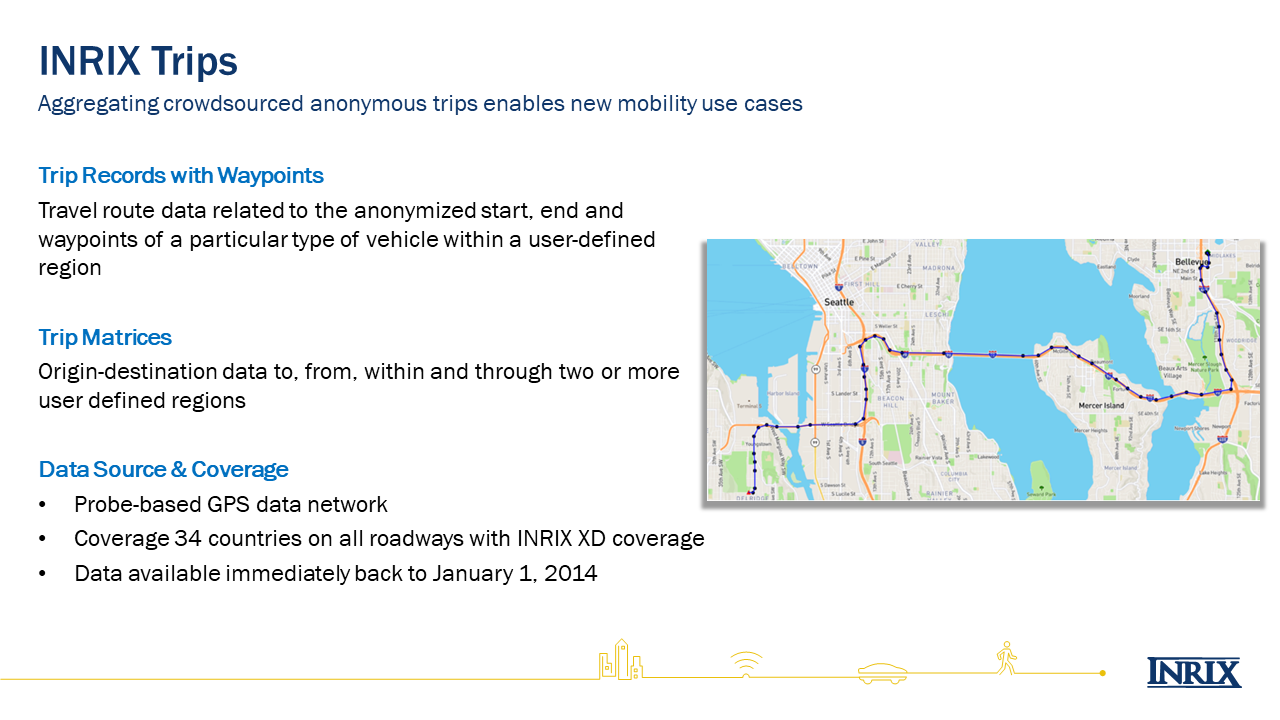
Trips data provided by INRIX is an aggregation of waypoints originating from different sorts of vehicles that indicate where traffic is coming from and where it’s going to. These waypoints are sourced through a GPS data network, which makes it precise, and are aggregated every 1 – 15 seconds, which makes the coverage inclusive. The aggregation of waypoints are many different location dots that tell the story of how a vehicle is moving from A to B. In other words, it tells you the trajectory of a trip.
Additionally, trips data by INRIX also includes information about the vehicle type and weight class. For example, it tells you the difference between a passenger vehicle or a truck. This is an interesting aspect that can be further used and filtered upon inside the xyzt.ai platform to enhance use cases.
Use case 1: Identifying velocity profiles and congestion areas at the Elbbruke bridge
The Elbbruke bridge crosses the Elbe river in Hamburg, Germany. Using trips data, Bart Adams, CTO & Founder of xyzt.ai, demos how to use the waypoints to discover velocity profiles and identify congestion areas for traffic analysis.
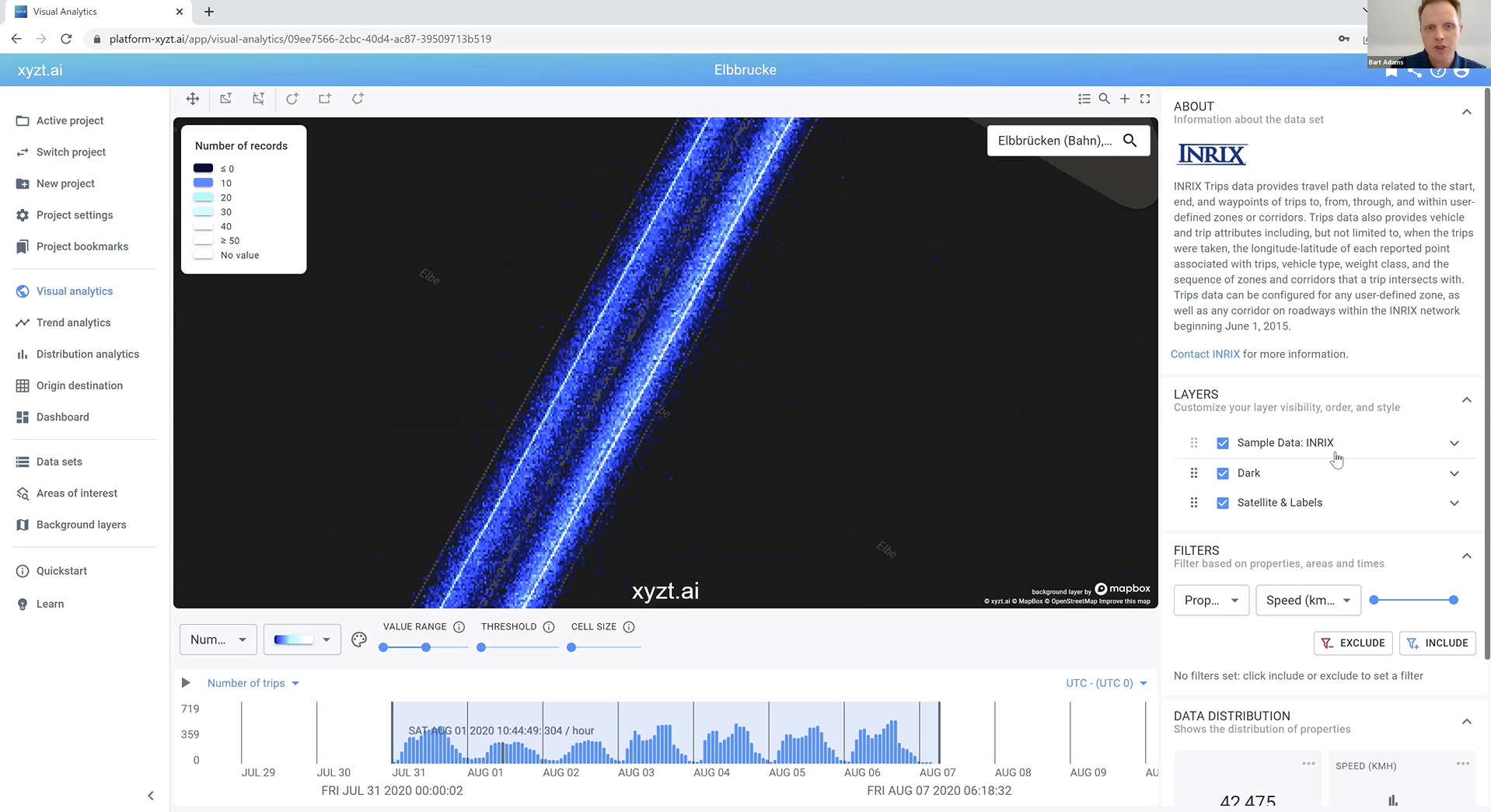
Bart is using the main analytical page on the xyzt.ai platform, namely the Visual Analytics page. There you have three different, but interconnected, views that represent the same data set.
- Heatmap: this screen visualizes the entire data set on a map with the possibility to add background layers, zoom in and out on the map, and select areas of interest.
- Timeline: using this view, you’re able to filter and analyze the data within a certain time range. You’ll notice there is a histogram plotted on the timeline, which visualizes a certain value over time, for example number of trips or speed.
- Data distribution: On the right side, there is a view that displays widgets which show the different properties found in the data that enable a more accurate and direct analysis.
In the picture below, you’ll notice Bart has selected a wider color variance that intuitively displays the differences in speed values found in the data. Next, he draws a circle on the map to select an area of interest for his mobility analysis. In this case, the Elbbruke Bridge. Then, he filters the data inside this area of interest by selecting the ‘Heading’ property, which allows him to only visualize traffic going either South or North.
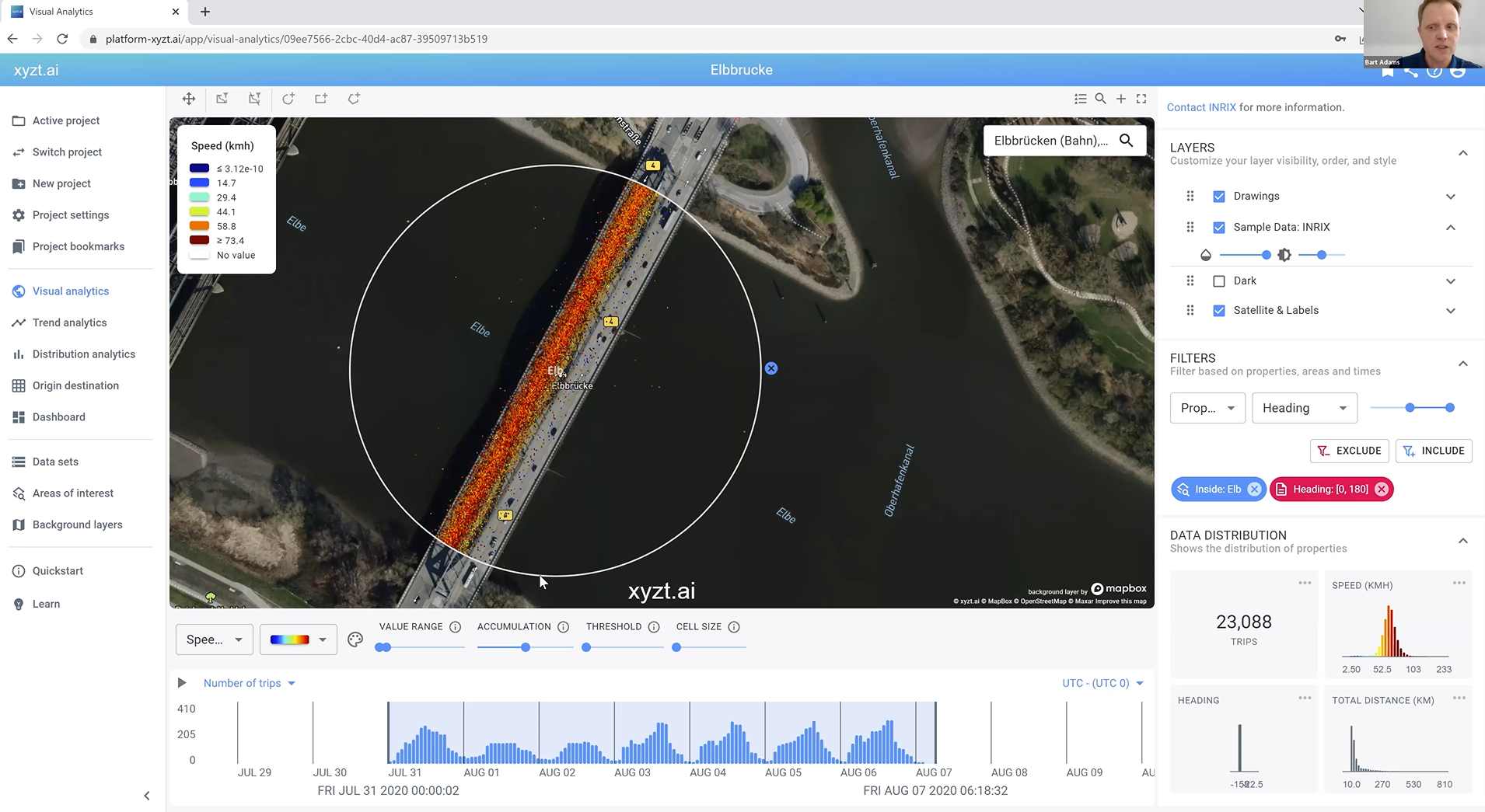
As Bart filters the data, it’s important to remember that all three views of the Visual Analytics page are interconnected and, therefore, automatically updated as you filter and apply values to specify your analysis.
To analyze velocity profiles and identify congestion areas on the Elbbruke Bridge, the easiest approach is to split the map so you double all of your views, which allows you to analyze and instantly compare the traffic activity on the bridge in both directions. One map only visualizes the traffic going North, the other one focuses on the traffic going South. This is such a powerful feature and can be done instantly on the xyzt.ai platform.
Register here to re-watch the webinar if you prefer a video breakdown of this urban use case for smart mobility.
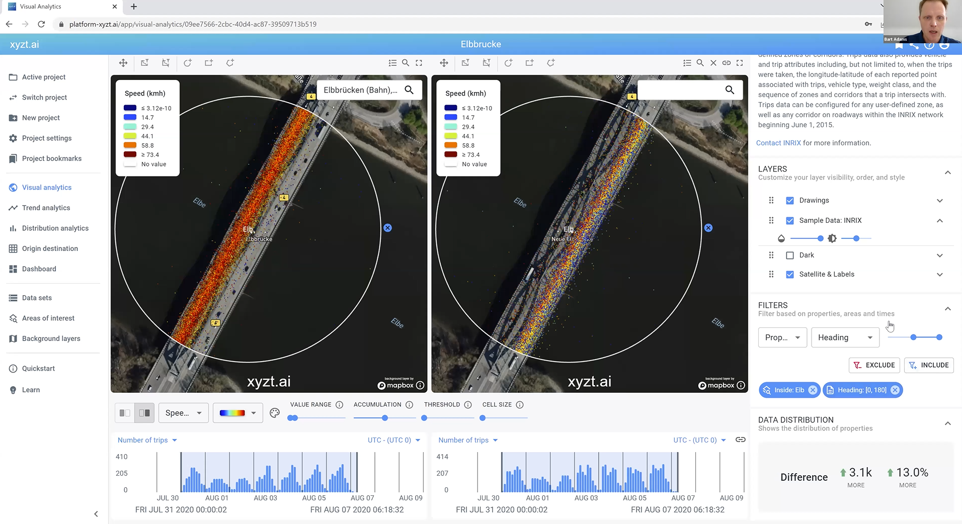
As illustrated in the picture above, you’ll notice the Split View tool and how it also doubles the data distribution panel and, therefore, also the velocity profiles. Further analysis of these profiles allow you to identify when vehicles are moving or when they are at a standstill, indicating possible traffic jams and congestion areas.
Use case 2 : School safety and speed profiles in school neighborhoods in Brussels
Using four weeks of traffic data, Bart analyzes the speed profiles in the neighborhoods around the schools in Brussels, Belgium, to determine how fast vehicles are really driving in those areas and what can be done to increase safety.
In the first use case, we discussed how you can create an area of interest by drawing a shape on the map. A second approach is easily done by uploading a JSON file with predetermined areas of interest, such as schools in Brussels. Bart uploads the file, selects a preferred distance range to specifiy the scale of traffic activity around the schools, and proceeds to the Visual Analytics page.
Now, together with the four weeks of data, many circles are plotted on the map showing where all of the schools in Brussels are located. The width of those circles is determined by the distance range Bart previously selected.
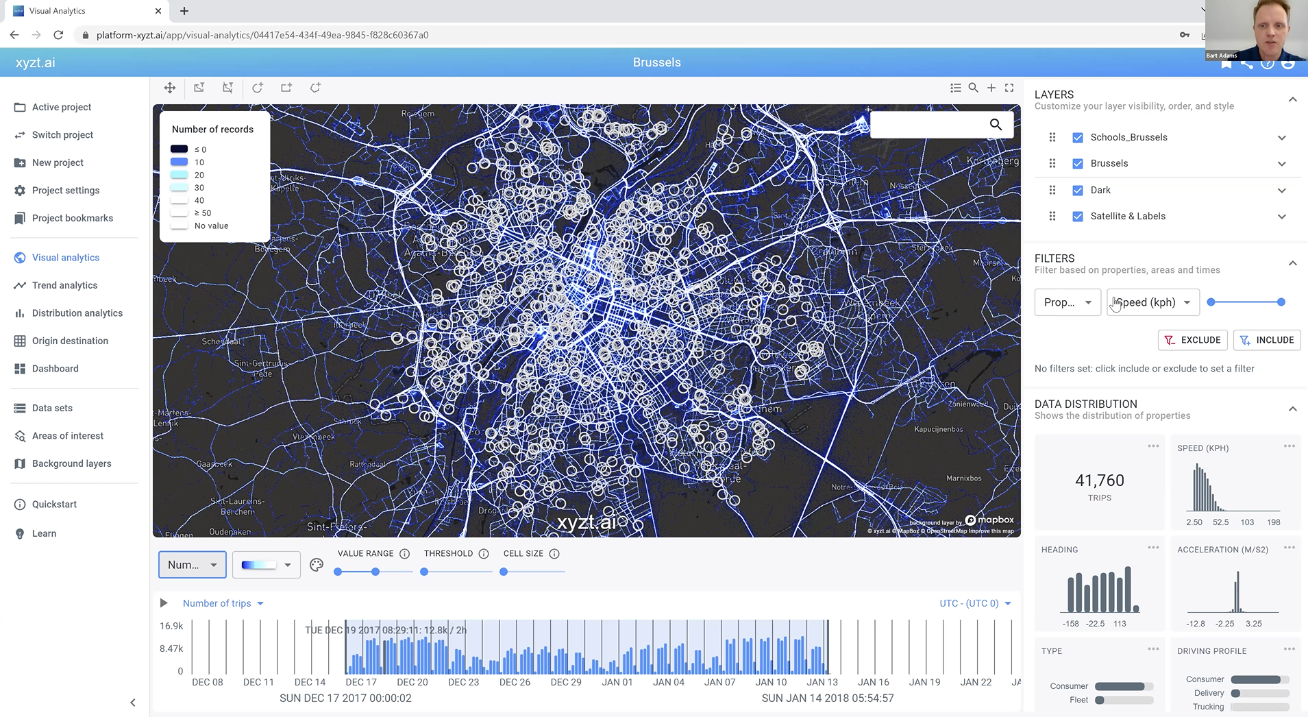
As you can see in the picture above, everything is a bit chaotic and the noise to signal ratio needs to be filtered down. Therefore, Bart applies a filter that tells the xyzt.ai platform to only visualize the traffic activity inside the areas of interest. In other words, the neighborhoods of the schools in Brussels. Now we have a much clearer picture as to what is relevant to our mobility analysis.
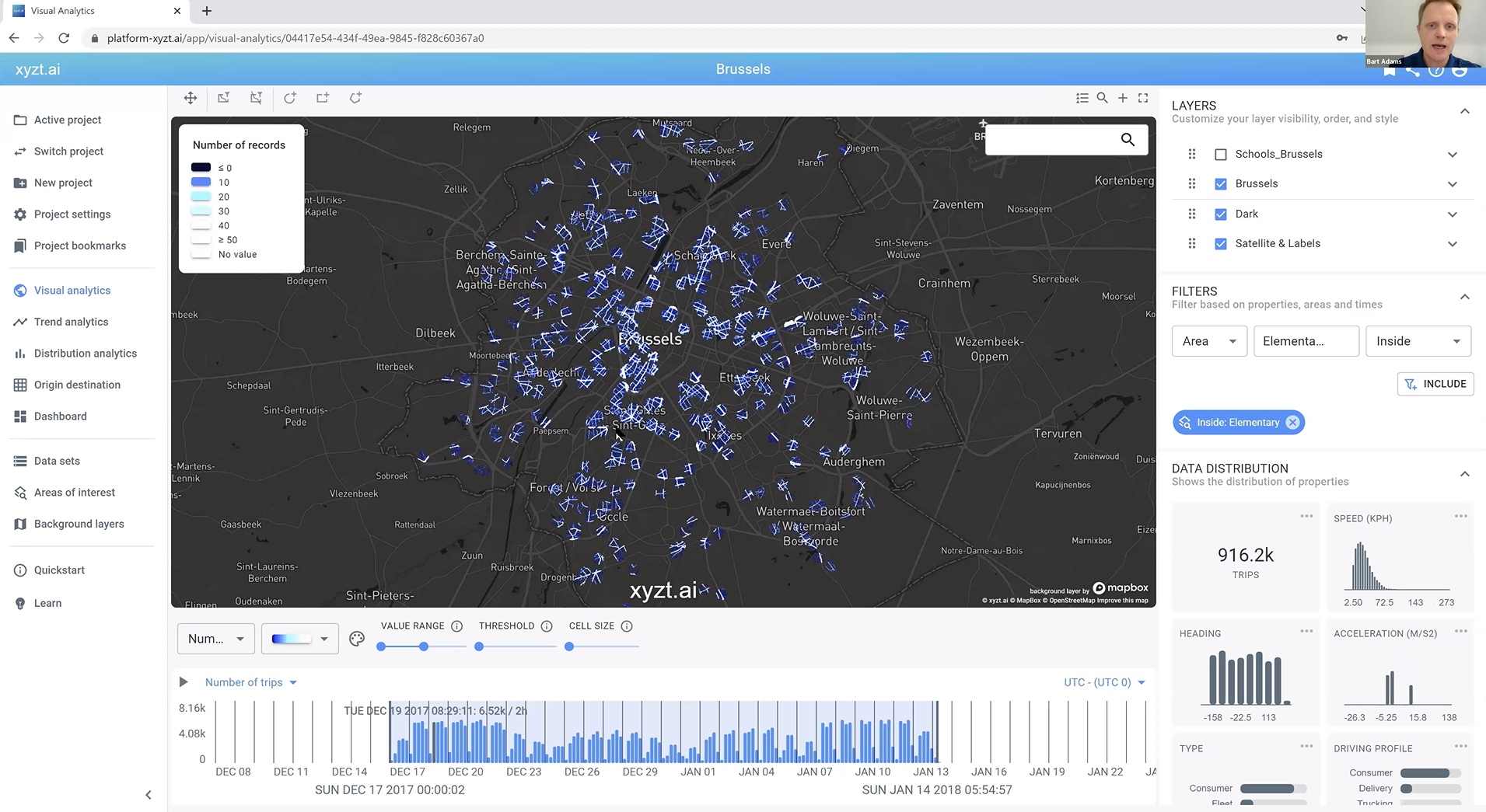
On the right side of the screen, a distribution panel shows you the speed profile for the data visualized inside the areas of interest. It tells you what percentage of the data is driving at what speed. Luckily, most of the data is showing an average speed of 15-20 km/h around the school neighborhoods. However, by further analyzing the speed profile, Bart notices some outliers and this is where it gets interesting.
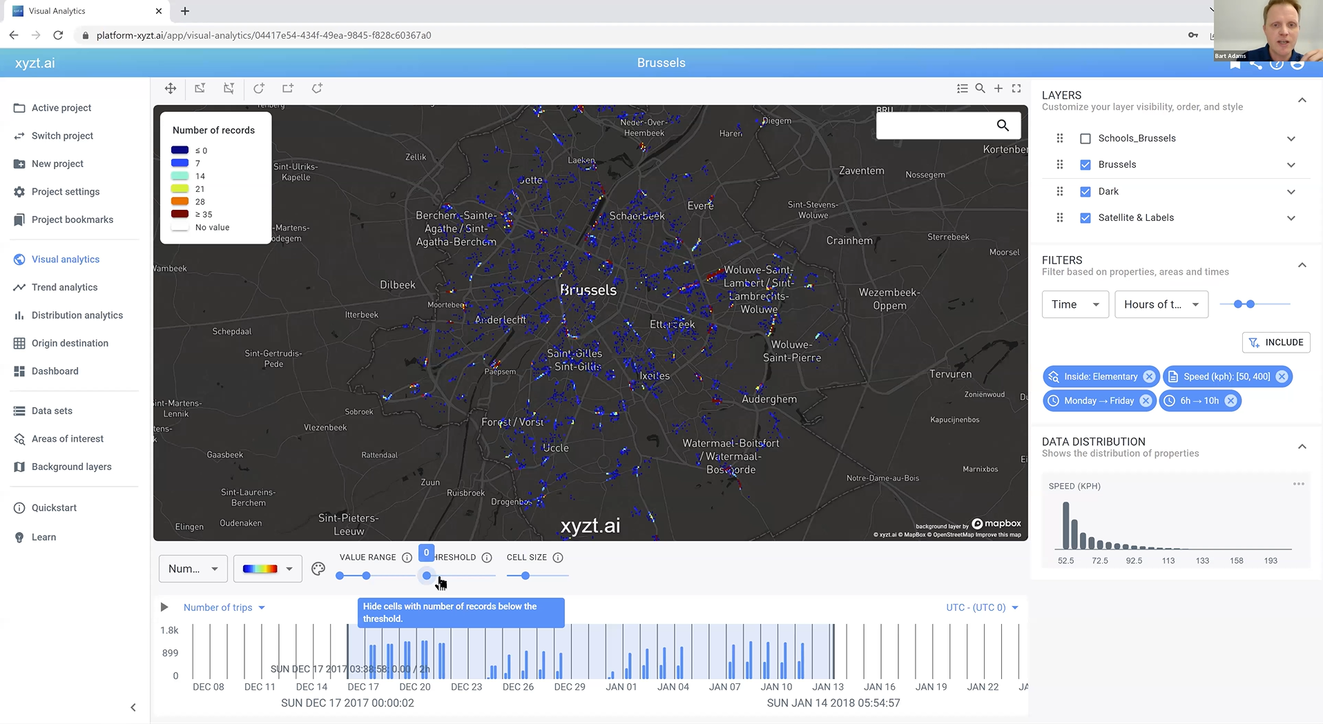
To accentuate these outliers, Bart adds another filter to the data by selecting the property ‘Speed’ and adjusting the value to only visualize those outliers. Now, you have a heatmap showing you traffic activity going 50 km/h or higher around the neighborhoods of schools in Brussels. This is a great use case for cities to detect dangerous situations and create new smart mobility strategies based on data-driven insights for a safer and more efficient urban environment.
To add another contextual layer to this mobility analysis, Bart filters the data further down by selecting school days and hours, and focuses on the problematic areas showing high speeds to pinpoint locations where new safety measures can be implemented.
Register now to re-watch the webinar and observe Bart explain it step-by-step.
Use case 3: Traffic flow after a detour and its impact on the surrounding roads
In Germany, the city of Lüdenscheid has a highway (A45) bridge that is unsafe and needs to be repaired. All traffic needs to be diverted, and using trips data in combination with the xyzt.ai platform; it is easy to visualize and analyze the impact on the surrounding environment.
The reparations for the highway bridge will take several years and considering it’s an important traffic highway, a lot of problems arise. With the instant availability of trips data and the xyzt.ai tool, we no longer have to guess where traffic is going and how people are navigating the detour. Let’s have a look.
Using the same 4-weeks of trips data, there are two relevant time periods: one representing traffic activity before the closure of the highway bridge and the other representing the traffic activity after.
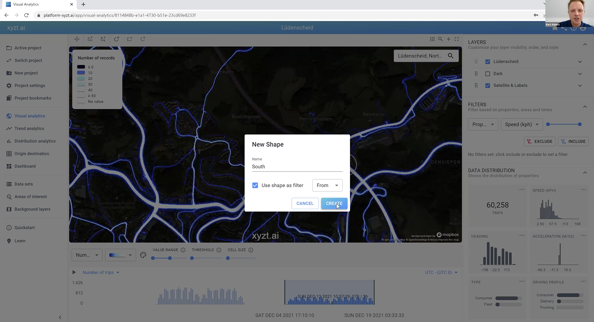
Bart applies a special filter that tells the xyzt.ai platform to only visualize the traffic that normally would be taking use of the Lüdenscheid highway bridge. He does this by drawing a circle right before the closure of the bridge on both sides of the highway: North and South. In the previous two use cases, Bart has drawn and used shapes to create areas of interest and analyze the activity inside those shapes. Now, he is using those shapes as a filter to select and follow the traffic that is moving from one shape (the South circle) to another shape (the North circle). This enables Bart to have an instant visualization of the traffic flow and the impact on the surrounding roads before and after the closure of the highway bridge.
In the picture below, you’ll see the fluent traffic flow before the closure of the Lüdenscheid highway bridge. Notice the two small circles on the map that act as two connection points and filters the data to only visualize traffic going from one circle to another.
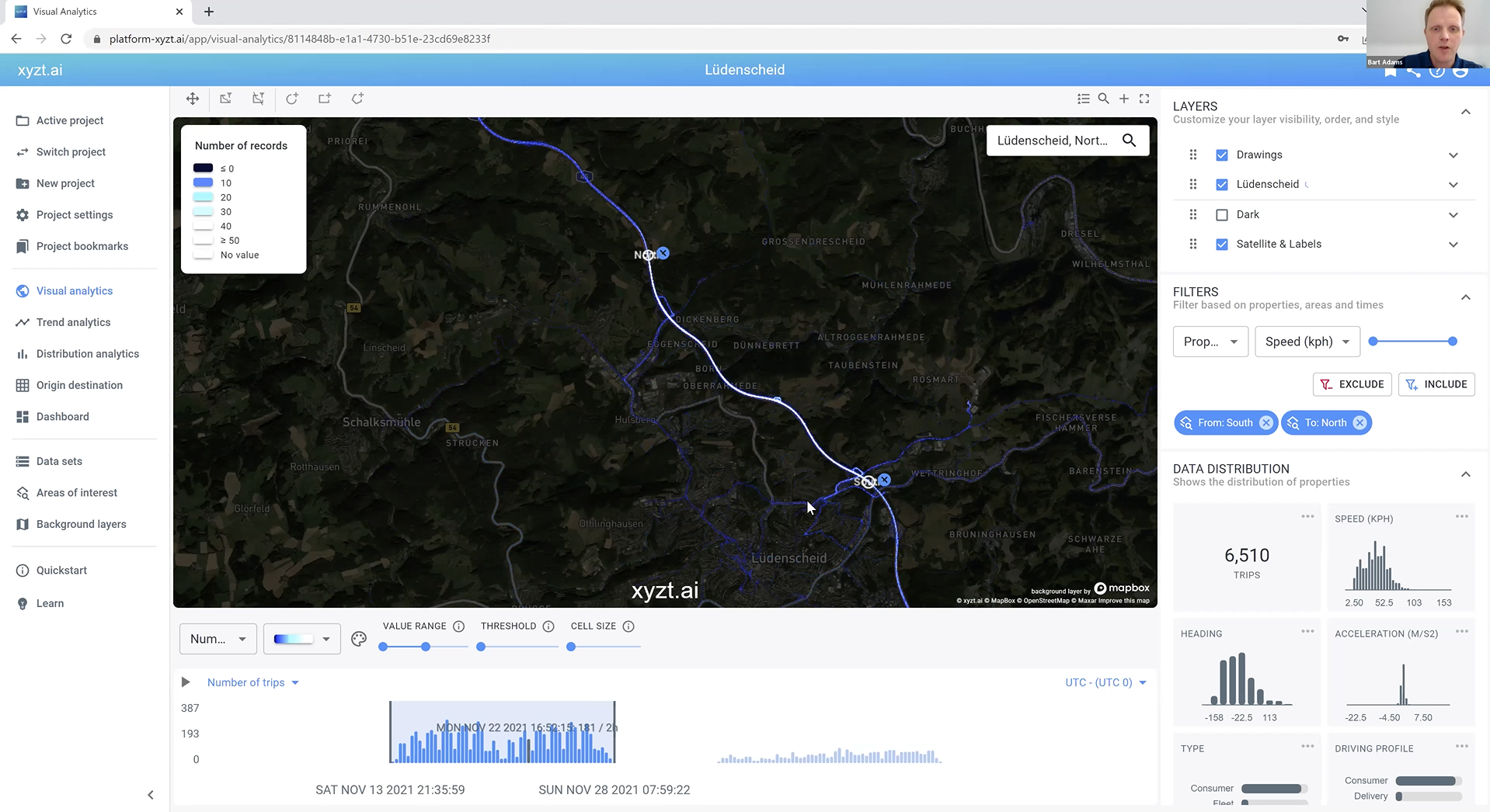
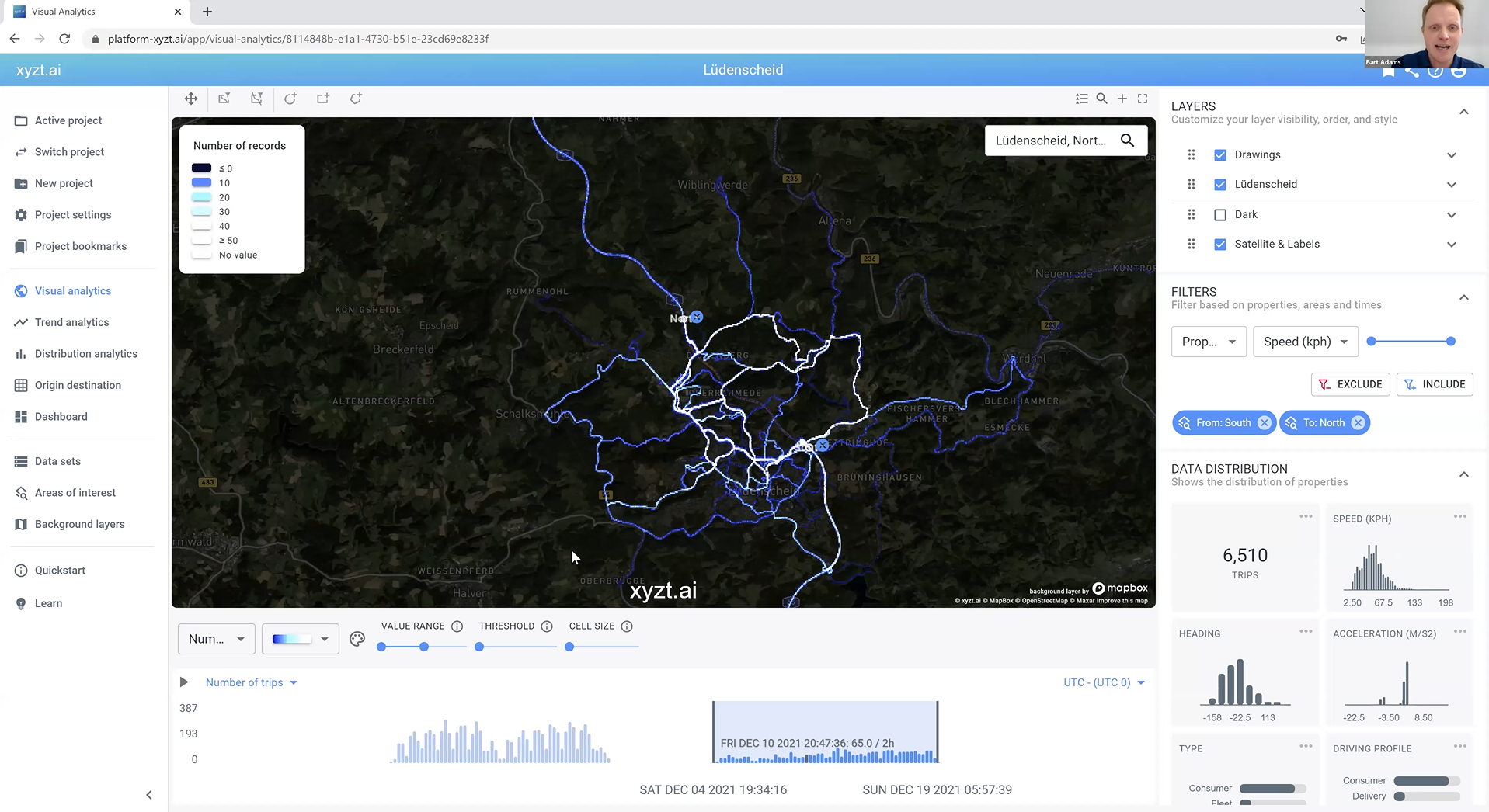
In the picture below, Bart has selected the time period after the closure of the highway bridge and you instantly notice a more chaotic traffic flow. Following these flows and analyzing how people are navigating the detour allows you to measure the impact on the surrounding roads and environment to create smart and sustainable mobility strategies that solve all sorts of mobility challenges. For example, Bart highlights an interesting observation: after the closure of the highway bridge, there is a considerable increase in traffic flowing through the city of Lüdenscheid. This opens the door to new points of analysis where you again can filter down the data and apply all of the different analytical tools the xyzt.ai platform provides to create a rich and contextualized mobility analysis.
Bart explains this use case in more detail during the joint webinar with INRIX. Sign up to re-watch the future of Mobility Analytics webinar.
Conclusion
A fundamental mobility transformation is in dire need. The European Commission’s European Green Deal has set milestones by 2030, 2035, and 2050 to create a smart and sustainable mobility future. Big data and self-service mobility analytics play an important role in contributing to the necessary innovation that will transform the smarter, cleaner, and greener mobility vision into a reality. Thankfully the technologies to embrace digital transformation exist and enable cities and companies to instantly learn and take action from big mobility data through the use of intuitive and scalable location intelligence platforms.
Did you miss the webinar? If so, don’t worry, you can request to watch it.
If you have any other questions, or if need help with your data visualization and analysis needs, please contact us.
